Wednesday, July 27, 2011

Jaclyn & Nates Rustic Chic Wedding


I am a huge fan of a Rustic Chic Wedding and have been waiting to blog about Jaclyn & Nates since I was first brought on board by event planner Jen Hansen of Gracious Events Management to design the table numbers, seating chart and signage. Thanks to Alison Taylor Photography I have some really stunning photographs of my work but there is no way I can do a blog about this wedding and only show my part. This wedding was EXCEPTIONAL and involved multiple creative individuals who all came together in their own way to make Jaclyn and Nates vision a reality.


I did not design the invitations but the designer did a really nice job at setting the tone with a color palette of hot pink and chocolate brown paired with a custom illustrated cowboy boot with a horseshoe designed by the Groom. The wedding was held in Peabody at the Historic Smith Barn which was the perfect setting.


I want to first begin with the table numbers in most cases they are usually folded or put in a clip but for this wedding real horseshoes where purchased off of ebay and the father of the bride created a wooden stand to hold the horseshoe. I then designed a 2 layer flat number card with a chocolate brown backer accented by a white linen card. All the table numbers were printed using a rodeo style font then hand embellished with hot pink glitter and attached to the horseshoe. The couple had a sweetheart table so I created a different sign using the boot designed by Nate and added each of their initials also hand embellished with hot pink glitter. On the back of the Bride and Grooms chairs were signs that read "Mr" and "Mrs" both were hand embellished with hot pink glitter and hung with hot pink satin ribbon.


The table linens were a mix of hot pink and white with either a hot pink or chocolate napkin therefore when I designed the menu card I used a single white linen card stock that continued the use of the same fonts from the rest of the signage and combined hot pink and chocolate ink. Each napkin was folded so the menu could be inserted into it which really gives each table an added design element.


A lot of brides dread the place cards/seating chart portion when planning their wedding, this is one of the items that is done last and by that time there is usually little creativity and money left over to handle it. I love when someone thinks outside the box and that is exactly what MOB Kim did. We had not yet decided on how to handle the seating chart but Kim new she did not want place cards. One afternoon I got an email from Kim with a picture of this weathered antique door that she had purchased at Flukes and Finds in downtown Newburyport........OMG I was out of my mind when she told me she wanted to use it to display the seating and how could we do it. I took measurements of the door and created two layered individual cards that were stuck to the door. Each card had the table number glittered in hot pink with the names of the guests printed above. I continued the use of the same fonts and card stock as used with all the other signage. The door was positioned at the entrance to the barn and finished with a stunning arrangement of flowers by Floral Artist Gregory Costa-Saint John owner of Flouer.


Caring about the little details in your wedding will make a difference and your guests will notice.....check out this FANTABULOUS sign that was created by Jaclyns Godmother Lynn Misiuk.....this is what guests first saw as they turned into the parking lot.....again a small detail with a huge result. Another little detail that I LOVED were the two huge lighted wreaths that hung on the big barn doors.....instead of leaving them plain Gregory decided to embellish them with flowers which just highlighted them even more.


I want to thank Alison Taylor Photography again for allowing me to use all of her photos in my blog, having professional photography of your work truly makes a difference. As you know I LOVE to share so if you have any questions about this wedding you can contact event planner Jen Hanson of Gracious Events Management . All the flower arrangements are the work of Gregory Costa-Saint John owner of Flouer. The couples cake was designed by Hilary Larson of Eat Cake in Newburyport and the wedding was held at The Smith Barn in Peabody.


Monday, July 25, 2011

Chuck E Cheese VS Custom Invitations

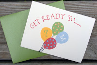
As a designer I LOVE a challenge and honestly feel it's those challenges that ultimately make you a better designer. If you read my blog then you know I do a lot of work with Janeen Donati owner of Paige-Reese Designer Bakeshop. Janeen and I have a very similar design style which is just one of the many reasons why I love working with her. A few weeks ago she sent me an email about her daughter Madison's upcoming birthday party. The first line read "I need some invitations for Madison's 7th Birthday, it's at Chuck E Cheese, I know I feel the same way......I CAN'T talk her out of it" Make no mistake I DO NOT have a problem with Chuck E Cheese but it presents a "generic" challenge when designing a one of a kind party invitation. My first thought was to create an adorable little mouse with a piece of cheese.....this way it relates to the party but would still be original and custom. Janeen LOVED this idea because in her mind she was thinking how cute a mouse cookie with a piece of cheese would be for a favor. The idea was presented to the birthday girl.....her response was that of a 7 year old "I like having a mouse but only if it looks EXACTLY like Chuck E Cheese and I want him to have a T-Shirt with a big C on it too and NO cheese" So obviously that wasn't what Janeen and I were envisioning but it's Madison's party so it should be her vision. The challenge for me was part of Madison's vision involved some copyright issues......there was no way I would be recreating the Chuck E Cheese Mouse......so back to the drawing board we went. It was Janeen that suggested a sneaker....I loved it because it kept with the whole Chuck E Cheese theme of running and playing but still would be original....and it was Madison approved:)


I've created a lot of artwork over the years but had yet to do a sneaker......OMG this sneaker was by far the most difficult piece of artwork I have ever done but totally rewarding; it may have taken me two days but I just love how it turned out. The best part of designing this invitation was the response I got from Janeen when I sent her the sample..........."you are NOT normal!  WOW!  the sneaker is awesome (super creative)!! it's comments like those that make me love what I do even more!


For the style of the invitation I decided to use a Z Card which folds open into three parts, I went with a heavy weight textured card stock called powder and paired it with a shimmery green envelope called envy. I used a fun kid like font and added some balloons with glittered polk-a-dots, we continued the use of the sneaker on the thank you notes and the tags for the cookies.


I handed the invites off to Janeen and could not wait to see what she came up with for the cookies and the cake. The party was yesterday and just a few moments ago my inbox began to fill up with pictures from her, my only thoughts are......SERIOUSLY WOW! I'm not saying creating art on a computer is easy but when it comes to cookies you are dealing with an entirely different medium. I am so stunned at her ability to seamlessly match the sneaker cookie to my invitation design.......that is what you call TALENT! There is no way you can have a party without cake......check out how Janeen was able to carry individual elements from the invitation over to the cake and I am not just talking color people.......she added the words run, jump and play and was able to do it in a similar font. She then incorporated the number 7 and the balloons.......I am just in AWE! You can see more of Janeen's work by visiting her blog www.paige-reese.blogspot.com you will not be disappointed!


Stay tuned.......Janeen and I have been working together on another birthday party....lets just say we both finally get to use a MOUSE........will post late August:)


Wednesday, July 6, 2011

Wedding @ The Four Seasons Hotel.......BOSTON

Trying to find the right Stationer for your Wedding Invitations is kind of like shopping for a bathing suit ONLINE......you see one, click on it, hit zoom, view all five angles and immediately think OMG I LOVE IT.....it's exactly what I have been searching for. As you move it into your cart and proceed to check out you can totally see how it will look on you; after all it's your size, style and the price is totally in your budget so you just know it will be a PERFECT FIT! Then the mail arrives and you think oh know.......wrong on so many levels!
I am not saying that you have to TRY every single bathing suit or Wedding Stationer that you like on for size but boy will you be happy that you did! Planning your wedding can be a very emotional, overwhelming and time consuming process, the vendors you chose to hire not only need be able to execute your vision but they should be able to connect with you on a personal level......... so before you put them in your cart take the time to make sure they are............A PERFECT FIT!

I first met Amanda and Chris at the wedding workshop a few months ago they are one couple that DID NOT need this advice. Before booking The Four Season's Boston this couple had already viewed about 50 different venues.........insane? no, it's SMART. I've listened to countless brides complain how they love their venue but not the staff associated with it. This is what I mean by a good fit....you may LOVE the room but do you have the same feeling about the staff that comes with the room because the room is not who will be handling all the little details of your wedding. When Amanda told me about The Fours Season's she talked about the gorgeous room and how perfect it was but what she also talked about was her LOVE for the Wedding Planners that came with the room. They took the same approach with regards to their Wedding Invitations, Amanda told me she order over 38 different style Wedding Invitation samples from numerous online sights but every time they would arrive she was always disappointed.


Amanda was immediately drawn to the 6x9 pocket fold invitation in black linen, the main backer was a stunning vine like pattern called plumes which we paired with a rich shimmery accent backer called burnt sugar. The main invite and matching components where all in ecru linen. The design was completed with a vellum overlay that also had the plumes pattern. I used a mix of different style vintage frames throughout the invitation suite. The design around their names on the main invitation was also used for the matching custom postage on all the wedding envelopes and response envelopes. The entire look was completed with a two tier custom address label wrap for each guest. The table numbers match the look of the wedding invitation with each number glittered in black. The place cards are also layered using the black linen plumes and burnt sugar.........this invitation truly sets the tone for Amanda and Chris' formal Wedding at the Four Season's Boston. They were such a wonderful couple to work with and I am truly flattered that after 38 different designers they picked me:)