I first met Katharine and Heath after designing their Bridal Shower invitations for Katharine's Mom. Katharine's wedding invitations had already been designed but she wanted to work with me on a NEW design that could be used for her rehearsal dinner invitations and then carried over throughout the rest of the wedding. As a designer I truly rely on talented photographers to capture my work on display at weddings and events. I am so lucky that Katharine and Heath hired Lauren Halvorson of Lauren Halvorson Photography, not only is she incredibly talented but she flawlessly captured some great shots of my work. I reached out to Lauren about using some of her images from Katharine and Heath's wedding for my blog, she could not have been more responsive or nicer to work with. I actually emailed her my 20 favorite images this morning........a couple of hours later she sent me an email with all the images I requested.....LOVE productive professionals...thank you LAUREN!
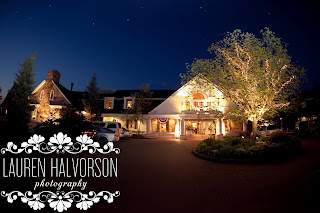
The invitation color palette was navy and hot pink which Katharine wanted to keep but now wanted to add in a pop of chartreuse. First up was designing a logo for them. The wedding venue was on Lake Winnipesaukee at Church Landing in Meredith, New Hampshire. This venue is simply stunning and as you can see from all of Lauren's photos ....their day was picture perfect! My jumping off point was a pair of OARS, the wedding was on the water and they had these beautiful oars for their guests to sign. I built the oars in Illustrator and incorporated a frame in front that would be used for their names. This design had a great element of function as it was easy to tweak to be used on other elements in the wedding while keeping the same feel.
Their new wedding design was first used on the rehearsal invitations. I chose a long 4x9 navy backer with the invitation printed on a textured white called powder paired with a hot pink envelope to complete the design.
For the place cards, Katharine wanted to use all three colors, as you can see from the photo it gives a nice look when placed around the stunning rustic floral arrangement designed by Emily Herzig Alberini of EH Floral Design in Littleton, New Hampshire. Each place card's number was hand embellished with hot pink glitter which matched the glittered table number. Instead of doing individual menu cards I created Katharine a pocket style card that had the table number mounted on one side then on the back the menu was inserted into the pocket.
Using their oar logo, I created a sign for their signature drink "THE MOJITO" replacing the circle with a lime that was hand embellished with glitter. The same was done for the "ICE TEA" sign but with a glittered lemon........super cute!
I spent three hours looking at Katharine and Heath's wedding photos and it was truly an incredible wedding.....the kind you see on wedding blogs like Style Me Pretty or Grey Likes Weddings. From the hot pink heels to the hot pink glitter.....it was clearly evident that this Bride and Groom truly thought of the details when planning their wedding.
I would like to thank Katharine and Heath for allowing me to be a part of their day, it was a pleasure to work with you both, I wish you nothing but happiness! I also would like to thank Lauren of Lauren Halavorson Photography for allowing me to use her photos in my blog:)
VENDOR CREDIT
Venue:Church Landing in Meredith, New Hampshire
Photographer:Lauren Halvorson Photography
Florist:Emily Herzig Alberini of EH Floral Design
Wedding Dress:Essense of Australia, purchased at A Day to Remember
Shoes: Kate Spade


1 comments:
You both look lovely as a couple. I liked all your photographs. Wedding dress is very beautiful. I am planning my wedding at mount tambourine. Could you please recommend me any wedding dress shop near Mt. tambourine?
Post a Comment