Tuesday, September 20, 2011

Sixty and FABULOUS!!!!!!!

I’ve said it before that majority of all my customers find me by word of mouth which is the best kind of advertisement. So before I discuss this incredible birthday design I need to thank Liz owner of Mason and Madison in Middleton because she put my blog address on her website Jane was able to find me:)


I received an email from Jane who was in the process of planning her mother-in-laws sixtieth surprise birthday party but was extremely short on time as the party was set to be September 17th. Jane is the best client a designer could have because she herself is an event planner therefore when she came for her design consult she new right away what she wanted. The color palette would be hot pink and graphite but she also wanted to incorporate a damask pattern because her mother-in-law Helen loves it. I listened as Jane described Helen a modern, stylish, forward moving grandmother who just happens to be turning sixty. I originally planned on doing something using the number 60 but no matter which way I designed it or what font I used it kept screaming the wrong thing. Just in case you didn’t get the memo last year Oprah said that “FIFTY was the new FORTY.” This means two things first, I’m really still in my mid twenties and two, Helen is really turning fifty. That being said age is just a number which explains why when I finally changed 60 to Sixty...........my design got a whole lot more FABULOUS!


Jane wanted a long card and for the design to be horizontal. The main backer was a two tone graphite damask style pattern, the invite backer was a shimmery pink called boa and the main invitation was a shimmery white called first snow. The ampersand was hand embellished with hot pink glitter and the completed invite was inserted into a shimmery pink envelope.


There would be a candy bar at the party so I suggested using pyramid favor boxes to line the table for guest to use to hold their candy. We decided to mix the boxes using half in the pattern and the other half in the pink which will create a nice design element to the table. Jane LOVED the idea of signage so I designed a sign for the birthday girl’s chair and one to highlight the candy bar. The last sign was for a signature drink what they would be serving. Jane wanted to come up with a fun name for it so I asked her what the grandchildren call Helen and she said “MIMI” SERIOUSLY this could not have been more perfect because the drink was a martini so I of course I changed it to a “MIMITINI” never shaken only stirred...........the sign of a true grandmother.


Saturday, September 17, 2011

The Custom House Maritime Museum

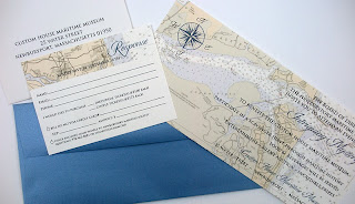
I'm so excited to talk about this recent invitation design I did for the The Custom House Maritime Museums Annual Patron's Gala. I truly believe when you combine the talents of different creative individuals unbelievable results can be achieved. The process began with a call from Jen Hansen owner of Gracious Events she invited me to be a part of the creative team she was putting together for her upcoming event. I would be designing the invitations and tickets, Jen Wright owner of Jen Wright Signs and her Graphic Designer Tracey Smith would be designing the posters and signage. From the moment I met Jen and Tracey I knew working with them would be fabulous. On a sunny summer day in Jen Wrights studio our meeting that was suppose to be short turned into a 2 hour creative brain storming session which resulted in a stunning vision for this years Patron's Gala.


I waited to see what Tracey came up with for the poster before designing the invitations because the purpose was to have a seamless look. I loved the logo she created for "Patrons Gala" on the poster  as well as the look of the map in the background. Those two items were my jumping off point when creating the invitations. The CHMM is located in historic downtown Newburyport where the once thriving maritime commerce was the pulse of everyday life. The Custom House erected in 1835 serves as a connection from the past to the present. I feel the invitation suite reflects a maritime feel while maintaining an elegant look that you would find at an affair like the Patron's Gala.


I design a lot of invitations and it normally ends there; it's rare to be at an event that I've designed an invitation for. I am so excited because not only will I be attending the Gala but I will be participating in the Event Planning side. I've recently joined the fabulous team at Gracious Events and was able to see first hand how an event comes together. Being inside the venue prior to designing the invitation truly gave me some insight that I normally may not have had.


An evening of "Intriguing Mystery" will take place on Friday September 23rd from 7 to 10 in the evening. I personally invite you to join us for a Scavenger Hunt through maritime history and to try your luck at the raffle or silent auction. As an active participant in the auction I know first hand that we have some wonderful items to bid on. It is going to be a beautiful evening in the heart of downtown Newburyport with live music, waterfront views, superb delicacies and micro-brews. If you are interested in purchasing tickets please go to The CHMM's website or send an email to info@thechmm.org.

Friday, September 9, 2011

MV BABY on the way!!!!!!!!!!!!


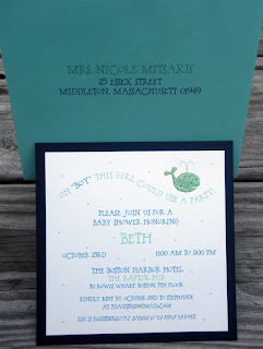
For this recent baby shower invitation the inspiration came from the parents hometown of Martha's Vineyard. Stephanie had emailed me asking if I could design an invitation for her sisters upcoming baby shower, her only request was to use a color scheme of blue, green and teals...........oh and of course a WHALE! I have two different styles of whales but decided to design a new one because it needed a more whimsical feel to it. The backer was a navy card stock and the main invite was printed on white linen. The design was accented by a caspian envelope with a green liner and was completed by adding clear glitter to the whale.


To continue the feel of Martha's Vineyard I used a bubbly style font and had the tag line mimic the look of a wave. Most people would not consider the envelope to be part of the design but I always try to incorporate a bit of the interior design on the outside; it gives guests a little sneak peak to what maybe inside. I LOVE how this invite turned out and just think it is perfect for this new MV BABY on the way!