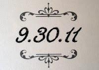
Now for the design, lately I have noticed a lot of save the date designs that have so much information on them one would wonder why bother sending out the wedding invitation. We chose a two layer 5x5 square layout a perfect size because Jackie wanted the information to be simply stated. I used a touch of script mixed with a clean font and a few ornamental accents. She wanted to use glitter but could not decide on what color would be best, Jackie is actually the first person that has ever asked to see the glitter (in the jar)....but by opening a few jars of different colors while looking at the card stocks she had chosen really made the the right choice evident. Hands down the winner was black.....yes I know everyone says its bad luck to use, include, wear or even talk about the color black when it comes to weddings but that was forever ago. Ive been happily married for 13 years and both my mother and mother in law wore black to my wedding, to me black is timeless, classic and never goes out of style. Black glitter does not have the same look or feel as colored or even clear....it sparkles but is far more opaque giving Jackie's design a unique look.
 |
| Envelope shown with optional custom address printing. |


0 comments:
Post a Comment