It doesn't matter what type of designer you are, if you're creative then most often than not something inspired you to create. I openly state at the top of my blog that "it's the people I meet along way that inspire how I design" which is true, but by nature I am a visual designer so when I create a piece of artwork I usually start by finding something that inspires me.
About a year and a half ago was the first time I met Hilary Larson owner of Eat Cake in Newburyport. Liz White of Mason and Madison had asked me if I would design some glittered cards up to be placed in front of the cupcakes she was serving at her grand opening. My FIRST stop for inspiration was Eat Cake's website it was also my LAST.......there was no need to look any further. I have been a fan of Hilary's creativity since I first saw her work and to this day one of my favorite cake designs that she created was that of a PIN CUSHION, if you click the link you will see exactly what I mean.
I recently met with Hilary to discuss design options for invitations she would be needing for her friends up coming baby shower. During our meeting I showed her some of my recent work one being a farming birthday invitation. I was pleasantly surprised when I received an email from her tonight with a photo of a cake she designed telling me that my farming invite was the inspiration.....I can't even tell you how happy and flattered I felt that one of my designs created inspiration for someone else.
As you know I always talk about who is behind a design, so I emailed Hilary asking what the cake was for? It's actually a celebration cake, the Uptons had recently grown by two feet and it was time for Kellan to meet some of Daddy's family out in Western Massachusetts. What a fabulous idea....I don't know anyone that doesn't love to EAT CAKE!!!!!!!!!!!
Friday, October 1, 2010
Friday, September 24, 2010
Down on the FARM!!!!!
As you know I never create generic samples, so I was super excited when Catarina called needing invitations for her son Nico's first birthday. The theme was Down on the FARM.......OMG I have been dying to design for a fall themed birthday. Her only request was that there had to be a pumpkin somewhere because he was their "little pumpkin" and the kids would also be picking and decorating pumpkins. Catarina chose Smolak Farms in North Andover for the party venue, which was perfect!
When designing for any invitation I do a lot of research but because I've been waiting to do a farm theme invite I had a head start. My idea was to create a barn like feel, which is why I chose a gated card style in shimmery red. The gates opening give a realistic look of barn doors. Next up was the artwork, I first made the barn and added a window at the top for the pumpkin to sit in but wasn't happy with how it looked. Feeling the window needed something with more substance I created a rooster and had it sit on layers of hay that hung out of the window. The rooster was finished with red glitter and the hay with clear glitter.........now it was PERFECT!
The barn artwork was printed on linen white with a backing card of french roast by mounting it to the gates on the front of the card really sets the tone before you even read the invite. The main invitation was printed on linen white using a mix of western and whimsical fonts. The glittered pumpkin found a perfect home on the interior of the invite adding a nice balance. The main barn artwork was also used on the thank you notes and favor tags.
The pumpkin artwork work was used as an accent to the return address printing on all the envelopes. Catarina like the barn so much that we put it on a plate and bowl set personalized with Nico's name which he could use on the day of his party for cake and ice cream. I was thrilled with how this invitation turned out but was even happier that Catarina LOVED IT!
When designing for any invitation I do a lot of research but because I've been waiting to do a farm theme invite I had a head start. My idea was to create a barn like feel, which is why I chose a gated card style in shimmery red. The gates opening give a realistic look of barn doors. Next up was the artwork, I first made the barn and added a window at the top for the pumpkin to sit in but wasn't happy with how it looked. Feeling the window needed something with more substance I created a rooster and had it sit on layers of hay that hung out of the window. The rooster was finished with red glitter and the hay with clear glitter.........now it was PERFECT!
The barn artwork was printed on linen white with a backing card of french roast by mounting it to the gates on the front of the card really sets the tone before you even read the invite. The main invitation was printed on linen white using a mix of western and whimsical fonts. The glittered pumpkin found a perfect home on the interior of the invite adding a nice balance. The main barn artwork was also used on the thank you notes and favor tags.
The pumpkin artwork work was used as an accent to the return address printing on all the envelopes. Catarina like the barn so much that we put it on a plate and bowl set personalized with Nico's name which he could use on the day of his party for cake and ice cream. I was thrilled with how this invitation turned out but was even happier that Catarina LOVED IT!
Labels:
Children's Birthday Parties
Thursday, August 26, 2010
DIGITAL VS CUSTOM
Unless you've been living under a rock for the past 10 years then you know digital cards have a HUGE presence when it comes to invitations, thank you notes, and of course holiday cards. I'll admit there are a lot of great websites out there offering some beautiful designs and options. Hands down digital is obviously a less expensive option leaving a lot of potential clients going that route instead of custom. I was trying to think of a way to offer a more budget friendly approach to custom invitations and holiday cards. What I realized was "why does it have to be one or the other, why can't it be both?" Last year was the first year I invested in a digital photo printer and haven't looked back since.
If you know me then you know I HATE clutter and don't save anything but I do SAVE holiday cards. I LOVE the day after Thanksgiving, because I spend the next 4 weeks waiting for the mail to see everyone's cards, hanging each of them up on our slider. I think the most important thing about a holiday card is the "thought." Whether you send a photo card, regular card, fancy or simple someone thought enough of you and your family to send you a holiday wish. When I have Christmas dinner the first thing everyone does is look at the slider to see how everyone's kids have grown or who's families have expanded and I do the same when visiting others. If you drive by my house on December 26th you will see our tree in the driveway, if you came in the front door you would think Christmas never happened but if you go a few more feet to my slider you would see all the holiday cards still up......I keep them up until New Years Day when I carefully pack up all the current memories and look forward to next years.
Four years ago Annette was the first person I ever designed a custom holiday card for aside from myself, she believed in my talent long before I ever could. Not only has she been one of my biggest supporters but she has also been my very best friend since grade school. I remember clearly the first card I designed for Annette, I told her to send me a few of her favorite photos she would like to use....she sent me 15....and every year that number increases! She had taken photo's of Olivia in a tutu sitting on the brass ducks in Boston. Back then I was only offering red folded cards with black ink. She had extra tulle from her tutu so I used it as a wrap under the photo. The interior card had a printed message with two glittered stars....this card holds a lot of memories and it's nice to see how far my design abilities have come.
Annette's Christmas card from last year is the perfect way for me to show everyone how you can have your custom holiday card and still pay the mortgage. If you're someone that sends out a lot of holiday cards 50+ then doing 100% custom and getting everything on your wish list might be a challenge. What I did for Annette as well as many of my clients last year was we came up with a custom holiday card design using cardstocks, glitter ect.. but then I took that design and converted into a digital design. This approach is also nice because it allows you to use more photos.
Annette's custom holiday card was a 7x5 folded card in aquamarine that has a slight shimmer, the band was dahlia which perfectly matched the coral in both the kids outfits. For the interior of the card her message was printed on white linen, we added a sand dollar printed in coral then finished it with clear glitter. By using a folded card she was able to add another photo on the inside flap, for the envelope she went with the aquamarine.
When going the custom route for invitations or holiday cards if you are layering card stocks assembly will be necessary. I offer the option for DIY assembly or I can do your assembly. I tell everyone the same thing, assembly is NOT HARD its just time consuming.
Next up was the digital design, this was perfect for Annette because she had a lot of great photos of her kids and was now able to use a few more of her favorites. I kept the color scheme the same and added some snowflakes to the background. By doing part custom part digital Annette was able to stay on budget and still have a custom holiday card which made her happy as well as her husband Paul happy:)
Digital has come in very handy with regards to holiday cards but it has also been a nice option to compliment party invitations. I have found that someone who has just ordered custom party invitations will also need thank you notes too. Offering custom digital thank you notes has become very popular. Clients often have fabulous photos from the party and it's nice to share some of those memories with those who attended.
For the Gorman Carnival I designed their digital thank you note using all the same colors and fonts from their original party invitation. Krista had sent me a few different photos but in the end the family photo looked the best, we finished it up with a custom message from the family to all of their guests.
In my previous blog you read all about Francesca's First Birthday, you can even see the sample of her digital thank you note. What I did not know at the time was that Nadia had hired professional photographer Rachel Kate. Once I saw the photos there were so many incredible shots I decided to make some design changes to her original digital thank you note. Hands down Francesca holding the balloons is just too cute but equally as cute were those bloomer pants that said her name. Nadia's photographer Rachel had suggest that we put it on the back as a button, which got me thinking, because her name was written on the bum why not use it on the front instead of her name.......LOVE IT! There were so many incredible photos I highly suggest that you check out more of Rachel's work at www.rachelkatephotography.com you will not be disappointed.
Whether you're interested in Digital, Custom or both please feel free email me with any questions you may have about the process or pricing......and NO, September is not to early to start planning your holiday card!!!!!!! beecustom@verizon.net.
Annette's Christmas card from last year is the perfect way for me to show everyone how you can have your custom holiday card and still pay the mortgage. If you're someone that sends out a lot of holiday cards 50+ then doing 100% custom and getting everything on your wish list might be a challenge. What I did for Annette as well as many of my clients last year was we came up with a custom holiday card design using cardstocks, glitter ect.. but then I took that design and converted into a digital design. This approach is also nice because it allows you to use more photos.
Annette's custom holiday card was a 7x5 folded card in aquamarine that has a slight shimmer, the band was dahlia which perfectly matched the coral in both the kids outfits. For the interior of the card her message was printed on white linen, we added a sand dollar printed in coral then finished it with clear glitter. By using a folded card she was able to add another photo on the inside flap, for the envelope she went with the aquamarine.
When going the custom route for invitations or holiday cards if you are layering card stocks assembly will be necessary. I offer the option for DIY assembly or I can do your assembly. I tell everyone the same thing, assembly is NOT HARD its just time consuming.
Digital has come in very handy with regards to holiday cards but it has also been a nice option to compliment party invitations. I have found that someone who has just ordered custom party invitations will also need thank you notes too. Offering custom digital thank you notes has become very popular. Clients often have fabulous photos from the party and it's nice to share some of those memories with those who attended.
For the Gorman Carnival I designed their digital thank you note using all the same colors and fonts from their original party invitation. Krista had sent me a few different photos but in the end the family photo looked the best, we finished it up with a custom message from the family to all of their guests.
In my previous blog you read all about Francesca's First Birthday, you can even see the sample of her digital thank you note. What I did not know at the time was that Nadia had hired professional photographer Rachel Kate. Once I saw the photos there were so many incredible shots I decided to make some design changes to her original digital thank you note. Hands down Francesca holding the balloons is just too cute but equally as cute were those bloomer pants that said her name. Nadia's photographer Rachel had suggest that we put it on the back as a button, which got me thinking, because her name was written on the bum why not use it on the front instead of her name.......LOVE IT! There were so many incredible photos I highly suggest that you check out more of Rachel's work at www.rachelkatephotography.com you will not be disappointed.
Whether you're interested in Digital, Custom or both please feel free email me with any questions you may have about the process or pricing......and NO, September is not to early to start planning your holiday card!!!!!!! beecustom@verizon.net.
Labels:
Holiday
Sunday, August 22, 2010
The Art of Writing a Letter....
When is the last time you sat down and wrote someone a letter? If you are like me then the answer to that question is, not lately. I have cute note pads that I write a short note to one of my kids teachers or sometimes I will use a folded note if I need to send a special "thank you" but that's about it. Like most people today if I need to reach someone I text, email, facebook and now even twitter them but just because all this technology exist doesn't mean you have to use it or that everyone in world is. Last night I sat down to watch TV and was excited to see Pride and Prejudice was showing AGAIN! I probably have watched this movie 50 times and LOVE IT but at the same time are frustrated by how long everything takes. For example writing a letter, in that era letter writing is what email is today. Throughout the entire movie almost every scene has a letter being received, written or read. I firmly believe if I needed to exist in that era I would not have made it for two very good reasons. First, I am extremely impatient there is no way I could wait a week to know if someone could come for lunch. Second, I am positive spell check did not exist and thanks to wikipedia I know the dictionary was not yet finished.
I recently received a request for personal stationery, I automatically designed the sample on a folded note card but soon learned what she wanted was stationery paper for writing letters. This was the first time I had designed personal stationery paper for someone.
Her request was simple white linen paper, white linen envelope with a black linen envelope liner. She wanted her name in a script font, a flower above it and her address at the bottom. What I love about this design is the flower actually has just a bit of glitter on it.
I recently received a request for personal stationery, I automatically designed the sample on a folded note card but soon learned what she wanted was stationery paper for writing letters. This was the first time I had designed personal stationery paper for someone.
Her request was simple white linen paper, white linen envelope with a black linen envelope liner. She wanted her name in a script font, a flower above it and her address at the bottom. What I love about this design is the flower actually has just a bit of glitter on it.
Labels:
Graphic Design
Saturday, August 7, 2010
Another FABULOUS Request!!
In my previous blog I said "if there is something you want ASK, if I can create it I will." I received an email late Tuesday night from my friend and really good customer Krista with a special request. She had been reading my recent blog and saw the picture of the "Mommy Juice" wine tag which gave her an idea. On Saturday she is going to a Bridal Shower and bought the couple their wine glasses and was going to put a few bottles of wine with it in a basket. Krista asked if I had ever heard of "Wine Poems-the 6 Firsts" which I had not so I clicked on the link which took me to this fabulous blog called The Perfect Bridesmaid. She wanted to know if I could put the poems on individual wine tags that she could put with the bottles of wine......OMG what a brilliant idea. This is why I LOVE being custom, it is nice to know that when a client has a vision that I can help make it a reality for them.....even with only 3 days notice!
So off I went to create the wine tags, I started with the timeless color scheme of light blue and chocolate brown and paired it with one of my favorite fonts MonteCarlo. The poems looked nice on the tags but I felt it needed something more personal....so I designed the couple their own monogram added a bit of glitter to it and positioned it below the poem.......PERFECT!
I would like to give a big thank you to Krista for sending me all the photos and for inspiring yet another great design. She has been on a roll lately because last week she needed a plate with a train on it. The funny thing is I didn't have one but thanks to her request I now have a super cute train and a little guy named Jack will soon be the first one to have this plate.
NOTE: for direct link to Wine Poems-the 6 Firsts
click the link below.
theperfectbridesmaid.blogspot.com/2010/03/wine-poem-6-firsts.html?utm_source=feedburner&utm_medium=feed utm_campaign=Feed%3A+ThePerfectBridesmaid+%28The+Perfect+Bridesmaid%29.
So off I went to create the wine tags, I started with the timeless color scheme of light blue and chocolate brown and paired it with one of my favorite fonts MonteCarlo. The poems looked nice on the tags but I felt it needed something more personal....so I designed the couple their own monogram added a bit of glitter to it and positioned it below the poem.......PERFECT!
I would like to give a big thank you to Krista for sending me all the photos and for inspiring yet another great design. She has been on a roll lately because last week she needed a plate with a train on it. The funny thing is I didn't have one but thanks to her request I now have a super cute train and a little guy named Jack will soon be the first one to have this plate.
NOTE: for direct link to Wine Poems-the 6 Firsts
click the link below.
theperfectbridesmaid.blogspot.com/2010/03/wine-poem-6-firsts.html?utm_source=feedburner&utm_medium=feed utm_campaign=Feed%3A+ThePerfectBridesmaid+%28The+Perfect+Bridesmaid%29.
Labels:
Weddings
Sunday, August 1, 2010
BeeCustom Designs First Home Party!!!!
About two months ago I received an email from Janeen, she had purchased some note cards at Mason & Madison and was interested in ordering some more personalized stationery. I operate on a very custom basis therefore, if you don't see what you need just ask, if I can create it I will. Janeen had two requests, first was she wanted a flat card with an envelope that had one of my cupcakes on it and for it to read Happy Birthday Love, Madison and Emerson that way every time she was heading to a party she already had a card to put with the gift....LOVE THIS! The second request was, would I do a home party? I was so excited because this would be my first one. I always wanted to do home shows but never pushed it because not everyone is a stationery person and I would never want someone to feel like they had to buy something just because they were invited. I created cute glittered invitations for Janeen to mail out to all her friends which got a great response. This being my first show I didn't know what to expect.......a lot of people purchased items from the cash and carry line and some ordered stationery to be personalized while others wanted Janeen's inspired birthday cards for their kids but by far the biggest seller of the night were the plates and bowls. These are a great gifts to give, because you can pick your artwork, color scheme and then have it personalized below are some of my favorites!
To Janeen, her family and friends, thank you so much for coming out and making my first home show a truly memorable one. I had such a good time and hope that all of you were please with what you ordered. So now you know BeeCustom Designs does home shows by request, if are interested in having one please feel free to shoot me an email beecustom@verizon.net.
Labels:
BeeCustom Design Happenings
Wednesday, July 28, 2010
Whale of a WHOOPIE!
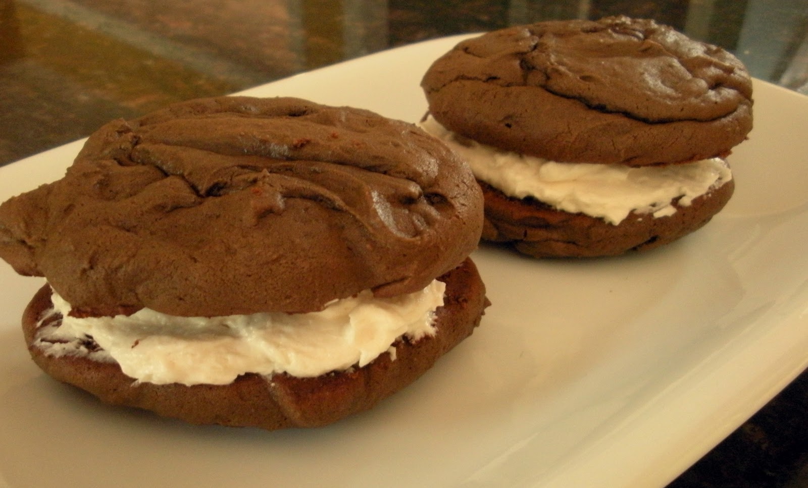
As you know I'm a graphic designer who mainly designs custom invitations....but I also own a restaurant in Wakefield with my husband Peter called ZALEKS named after our boys Zac and Alec. We've been open now for 5 years and over the last couple of weeks we have been working on a mini makeover. I just finished redesigning all of our menu boards and soon will be re-painting the interior too! Peter gets a lot of requests from our customers wanting something sweet.....so he asked me if I could make some WHOOPIE PIES to test out. My first thought was NO.......I have way to much on my plate but then my second thought was OK, BUT only if you come up with a cool name that way I can design a logo, signage, and packaging.
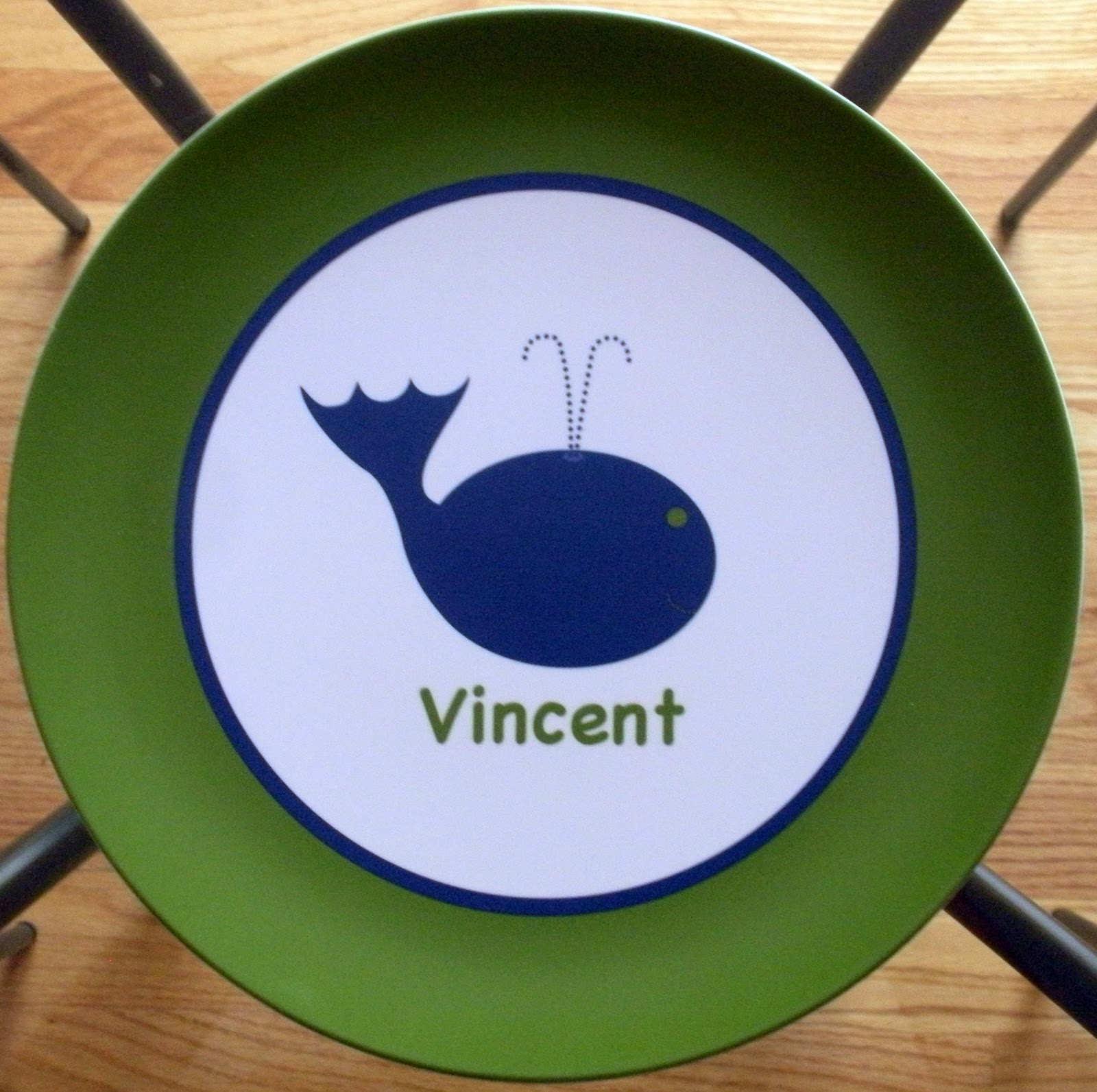
After throwing around a lot of different names he called me one afternoon and said what about "Whale of a WHOOPIE" I thought it was perfect because whoopie pies are a very New England item and so is the whale......an extra bonus for me was I already had a whale created. Zaleks has a huge menu of everything but our niche is seafood so I felt the logo and color scheme really worked well with the overall feel of the restaurant.
I made my first batch of 14 chocolate whoopie pies and brought them in on a Monday at 4pm. They were displayed on the counter with an adorable sign and each of the whoopie pies were packaged with a round glittered logo. By 9pm Peter called to tell me that we had already sold 10 and that everyone not only liked the whoopie pies but LOVED the packaging...YEAH! As long as they continue to sell I plan on adding pumpkin whoopie pies with cream cheese frosting and red velvet too.
I have to say I wasn't nervous about packaging the product....for me being creative is my comfort zone but when it comes to cooking.......let's just say if you happened to be at my Bridal Shower then you know there wasn't a shortage of jokes every time I opened a kitchen product. I CAN cook and bake but I am know where near as talented as my husband who is an amazing, self taught cook. For 16 years I have watch him cook for family, friends and customers never once looking at a recipe. I have seen his creative ability to come up with countless unique dishes for Zaleks daily specials each one out doing the next.
So if you happen to be in Wakefield stop by for lunch or dinner, bring your friends, a few bottles of wine (yes we are BYOB) sit inside or out and please don't leave without a Whale of a WHOOPIE PIE!!!!!!!!
After throwing around a lot of different names he called me one afternoon and said what about "Whale of a WHOOPIE" I thought it was perfect because whoopie pies are a very New England item and so is the whale......an extra bonus for me was I already had a whale created. Zaleks has a huge menu of everything but our niche is seafood so I felt the logo and color scheme really worked well with the overall feel of the restaurant.
I made my first batch of 14 chocolate whoopie pies and brought them in on a Monday at 4pm. They were displayed on the counter with an adorable sign and each of the whoopie pies were packaged with a round glittered logo. By 9pm Peter called to tell me that we had already sold 10 and that everyone not only liked the whoopie pies but LOVED the packaging...YEAH! As long as they continue to sell I plan on adding pumpkin whoopie pies with cream cheese frosting and red velvet too.
I have to say I wasn't nervous about packaging the product....for me being creative is my comfort zone but when it comes to cooking.......let's just say if you happened to be at my Bridal Shower then you know there wasn't a shortage of jokes every time I opened a kitchen product. I CAN cook and bake but I am know where near as talented as my husband who is an amazing, self taught cook. For 16 years I have watch him cook for family, friends and customers never once looking at a recipe. I have seen his creative ability to come up with countless unique dishes for Zaleks daily specials each one out doing the next.
So if you happen to be in Wakefield stop by for lunch or dinner, bring your friends, a few bottles of wine (yes we are BYOB) sit inside or out and please don't leave without a Whale of a WHOOPIE PIE!!!!!!!!
Labels:
Graphic Design
Saturday, July 10, 2010
The GORMAN CARNIVAL......is coming to town!
It's becoming very popular now for families to have ONE birthday party for all of their children rather than one for each. All the Gorman kids were born in the month of August so having a joint party was perfect. The idea for a carnival theme was brilliant based on the age range of children that would be coming. I was given full control of what the design would be as long as the color scheme was red and blue and it contained absolutely NO CLOWNS......Liam is afraid.....can't say I blame him either.
The main backing card was a red matte card stock called Geisha, the invite was printed on White Linen and the envelope was a stunning blue matte card stock called Aruba. Now that I had the card stocks picked out it was time to decide on the other elements. I knew I wanted to have some sparkle to the invite and felt the flags represented the carnival theme well and would look fabulous glittered. Next up was finding two fonts a carnival style and a more simpler one to compliment it. By having the text of the invite all parallel and mixing the two fonts it creates an element of design that works but is not over powering. I continued the use of the two fonts for the return address on the envelope as well as the optional custom address printing for the front of the envelope.
I had so much fun designing this invitation not only because I have always wanted to do a carnival theme but also because the clients were the GORMANS. This fabulous family consists of dad Joe, mom Krista, big brother Liam, twins Ryan & Anna.....oh and last but not least Greta the dog. If you read my blog then you know I consider it an honor to be a part of people's life moments, this has never been more true. Before Krista was the wife to one and mom to three she was my friend. I've known her now for twenty years and have been a part of many of her life moments not as a designer but always as a friend. It was an honor that she asked me to play both roles this time around:) So to you Krista, it's been a long road with many good memories and plenty of scary photos!
Labels:
Children's Birthday Parties
Subscribe to:
Posts (Atom)