Sunday, July 29, 2012

Laura & Marc


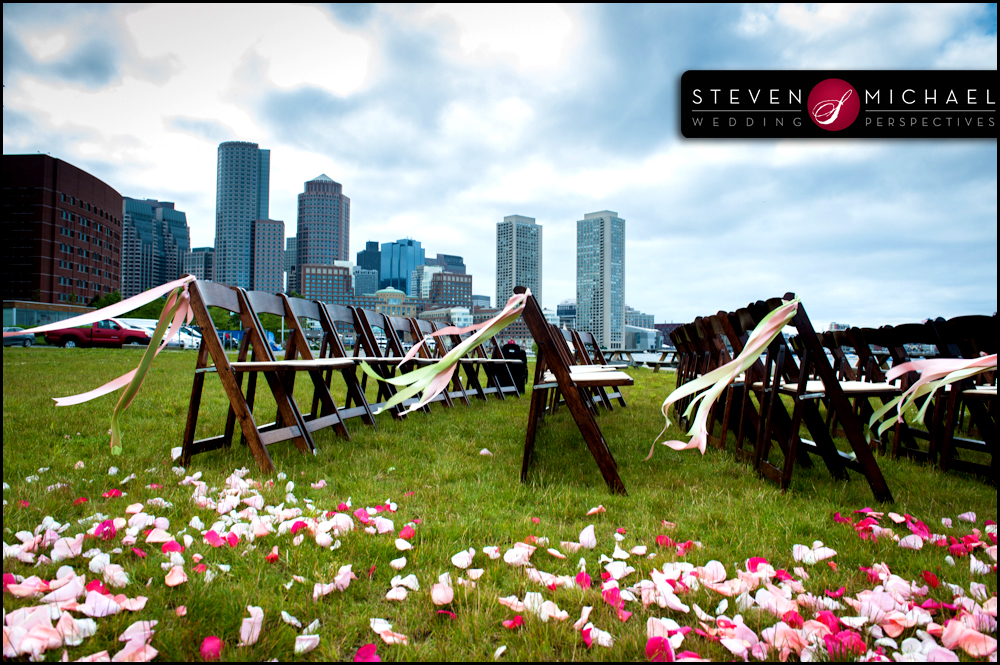
I have been waiting FOREVER to be able to blog about Laura and Marc's Boston Waterfront Wedding outside at Sam's at Louis. Ironically I never actually met Laura and Marc and didn't even know what they looked like until I saw their wedding photos by Steven Michael Pugliese of Wedding Perspectives. I received an email from Laura early winter about needing invitations for her June wedding, normally I meet with perspective clients in person but for Laura and Marc it was a phone consult as they were in the process of moving to London for Marc's job. After our initial phone chat we switched to email which worked out great. Not all weddings have a theme but there is nothing more FABULOUS then a LOBSTER BAKE June wedding on Boston's Historic Waterfront.....it doesn't get anymore New England then that!


The wedding color palette was hot pink and green mixed with various shades of pink. I designed a logo that incorporated their names into a scrolled frame and continued the use of that frame throughout the rest of invitation elements. The invitation was a square portable pocket in a shimmery hot pink paired with an apple green envelope. Laura did not want to do a typical reception card, she wanted a timeline using various artwork. I did a knot of rope for the ceremony, a drink glass for the cocktail hour then for the Lobster Bake I built her a lobster in Illustrator which was then hand embellished with red glitter. For dancing we used shoes then a boat for everyone to sail on home.....so fitting considering they were on the water.


My favorite part of this design was the FAN that acted as the wedding program. LOVE when my brides like to take the road less traveled.......You may not have noticed but SHOES are HUGE in the wedding industry. Brides are no longer wearing your traditional white but opting for something fun, colorful and usually sparkly or embellished. Instead of just listing the names of those in the wedding party we used stilettos for the bridesmaids, ties for the groomsmen, bows for the flower girls and a bow tie for the ring bearer. I am happy to share that Laura and Marc's invitation design was  recently featured on  the Wedding Lovely Blog.


When I began blogging about my designs it only included my work but in order to really see the entire vision I found it is best to show all the details of the wedding. Recently, I have been reaching out to my bride's photographers and have had such a wonderful response. Laura's photographer Steven of Wedding Perspectives did an incredible job of capturing all the beautiful details that truly make a wedding. I contacted Steven a few weeks before the wedding and he could not have been more gracious about allowing me to use some of his images for my blog. Before writing this I was on his website and found my way over to his BLOG, which I instantly LOVED! He not only shares the images but the story behind them and how they came to be. Out of all the vendors associated with weddings I would say photographers have it the hardest. Since the invention of the digital camera everyone thinks they're a "PROFESSIONAL" photographer. While in college I had to take a photography class as a part of my degree by the time I finished I had learned that photography really has little to do with the camera....it has to do with the eye behind the camera; the ability to see something that most do not. It's a God given talent..........you either have it or you don't and just in case you are wondering I was not given that eye which is obvious by looking at my photos verses Stevens:)


Laura had not found a floral designer yet so I recommended Gregory Costa-Saint John of Flouer and was thrilled when I found out she had hired him. Gregory is truly a gifted floral artist and I am always blown away by his work. It is pretty obvious that all the arrangement and bouquets where stunning but the stand out piece was the arch of flowers that Laura and Marc were married in front of.....seriously beautiful.


Laura did such an incredible job with the details of her wedding......her color palette was seamlessly carried out throughout the entire wedding. The New England Clam Bake theme......was flawless, from lobster cracker favors for all her guests to the newspapers for table linens. This couple may reside in London for now but it is evident from their New England Wedding that their HEART still lives here in Boston.


Thank you to Laura and Marc for allowing me to be a part of their day, it was truly an honor. Best of luck across the pond.........!

Wedding Photographer: Steven Pugliese of Wedding Perspectives
Venue: Sam's at Louis
Flowers: Gregory of FLOUER
Brides Dress: Melissa Sweet, altered by Andy Piccos in London
Flower Girls: Lela Rose

Tuesday, July 3, 2012

Katharine & Heath's Wedding


I first met Katharine and Heath after designing their Bridal Shower invitations for Katharine's Mom. Katharine's wedding invitations had already been designed but she wanted to work with me on a NEW design that could be used for her rehearsal dinner invitations and then carried over throughout the rest of the wedding. As a designer I truly rely on talented photographers to capture my work on display at weddings and events. I am so lucky that Katharine and Heath hired Lauren Halvorson of Lauren Halvorson Photography, not only is she incredibly talented but she flawlessly captured some great shots of my work. I reached out to Lauren about using some of her images from Katharine and Heath's wedding for my blog, she could not have been more responsive or nicer to work with. I actually emailed her my 20 favorite images this morning........a couple of hours later she sent me an email with all the images I requested.....LOVE productive professionals...thank you LAUREN!


The invitation color palette was navy and hot pink which Katharine wanted to keep but now wanted to add in a pop of chartreuse. First up was designing a logo for them. The wedding venue was on Lake Winnipesaukee at Church Landing in Meredith, New Hampshire. This venue is simply stunning and as you can see from all of Lauren's photos ....their day was picture perfect! My jumping off point was a pair of OARS, the wedding was on the water and they had these beautiful oars for their guests to sign. I built the oars in Illustrator and incorporated a frame in front that would be used for their names. This design had a great element of function as it was easy to tweak to be used on other elements in the wedding while keeping the same feel.


Their new wedding design was first used on the rehearsal invitations. I chose a long 4x9 navy backer with the invitation printed on a textured white called powder paired with a hot pink envelope to complete the design.


For the place cards, Katharine wanted to use all three colors, as you can see from the photo it gives a nice look when placed around the stunning rustic floral arrangement designed by Emily Herzig Alberini of EH Floral Design in Littleton, New Hampshire. Each place card's number was hand embellished with hot pink glitter which matched the glittered table number. Instead of doing individual menu cards I created Katharine a pocket style card that had the table number mounted on one side then on the back the menu was inserted into the pocket.


Using their oar logo, I created a sign for their signature drink "THE MOJITO" replacing the circle with a lime that was hand embellished with glitter. The same was done for the "ICE TEA" sign but with a glittered lemon........super cute!


I spent three hours looking at Katharine and Heath's wedding photos and it was truly an incredible wedding.....the kind you see on wedding blogs like Style Me Pretty or Grey Likes Weddings. From the hot pink heels to the hot pink glitter.....it was clearly evident that this Bride and Groom truly thought of the details when planning their wedding.


I would like to thank Katharine and Heath for allowing me to be a part of their day, it was a pleasure to work with you both, I wish you nothing but happiness! I also would like to thank Lauren of Lauren Halavorson Photography for allowing me to use her photos in my blog:)


VENDOR CREDIT

Venue:Church Landing in Meredith, New Hampshire
Photographer:Lauren Halvorson Photography
Florist:Emily Herzig Alberini of EH Floral Design
Wedding Dress:Essense of Australia, purchased at A Day to Remember
Shoes: Kate Spade


Thursday, June 7, 2012

Erika's Bridal Shower

I've been dying to share this recent invitation design for a Bridal Shower that took place in Florida.....so nice that BeeCustom Design is slowly reaching beyond the boundaries of Massachusetts! I first have to thank Jennifer Hansen of Gracious Events Management for recommending me to her client. Sister and MOH Kristen put so much time and thought into planning her sister's bridal shower....there was no detail left out. The color palette consisted of a range of soft pinks and the card stocks used throughout this design are seriously becoming one of my favorite combinations. The colors are soft and subtle but the card stocks themselves all have stunning textures to them so when paired together it truly gives a rich feel. The design started with a large square backer called seashell, a shimmery accent backer called cameo and the invite was printed on diamond. I used a stylish wedding dress on a hanger which was then hand embellished with glitter. The envelope, a very soft pale shimmery pink had each guests address custom printed to match the look of the invitation.


Kristen wanted each guest to bring their favorite recipe for a book she was making for her sister. The card would be included with the invitation so I created one that coordinated with the overall design. All the table numbers were glittered to add an extra pop on the tables. Kristen wanted to give her sister matching stationery to use for her thank you notes; I used the glittered dress on a folded card in diamond and then paired it with a petal pink envelope. All of the guests place cards were attached to a matching wedding dress cookie designed by Becky Breslin. I know I say this a lot but "DETAILS MATTER" and this design is a perfect example of that!


Tuesday, April 10, 2012

Courtney & Michael's Wedding

All my blog postings have a story that relates to the client/couple, who they are, how they met and what they envision for their invitation design. This post is slightly different because not only does it have a story but a little bit of my own childhood memories. Courtney found me through her sister and matron of honor Kerri, ironically Kerri and I were childhood friends and like everyone these days re-connected on facebook. I could only remember Courtney as she was the last time I saw her which would have been when she was around 4 or 5 years old. I spent quite a few of my childhood days playing at the O'Brien's house after school; back then we didn't call them "play dates" either. I remember Kerri trying to teach me all the dance moves to The New Kids on the Block "You've Got It (The Right Stuff) in Courtney's then playroom. Thank GOD the O'Brien's had a VCR, Kerri had to keep re-winding the tape because I was struggling to keep up....LOL! It's funny to think that 20 something years later that I would be designing Courtney's wedding invitations. When Courtney and her fiance Mike arrived for their design consult, here was this pretty blonde all grown up and I still could only remember the little girl version of her.


Well I guess we should discuss the design now......the chosen color palette was gold and amethyst, gold can be a little difficult when it comes to card stocks as the range of golds can really vary. She wanted a clean, elegant design and for the amethyst not to be overpowering. Like majority of my brides this year Courtney LOVED the portable pocket which had a beautiful pattern called Regalia the color of the pattern wasn't exactly pure gold but when we paired it with the amethyst it was perfect. If my memory is correct it was actually Mike that found the "winning" pattern.......see who said guys don't care about the details too! When it came to the overall design and layout Courtney like the idea of using their names with just a bit of ornamental design surrounding it. You can see that the use of the ornamental design was carried over to all the other pieces of the invitation suite as well as the place cards, menu cards, table numbers, programs and signage.


Normally when I post a wedding blog I try really hard to not only include photos of the invitation design and accessories but of all the other elements. I was thrilled when I reached out to Courtney's & Mike's Photographer Bharat of Bharat Parmar Photography about using some of the photos he took at their wedding. Bharat immediately responded to my email and gave me the code to choose what photos I would like for my blog, clearly you can see what photos I took and what photos Bharat took:) I looked through his entire portfolio which was really notable; so for all the brides out there that have not found a Photographer I highly recommend looking at Bharat's work, you will not be disappointed.


I have to take a moment to discuss Courtney's WEDDING DRESS.......it was seriously STUNNING, I just loved all the elegant details of it. I have seen tons of wedding gowns but never one as unique as hers, it was so light and airy. Her choice for the bridesmaids was also fabulous, the deep amethyst color was perfect for a March Wedding and all her bridesmaids look beautiful in it. There was only ONE other little lady that day who may have stolen the show for just a few minutes.......flower girl extraordinaire and Courtney's niece AVA who learned to walk just three months before her big day. She was the cutest flower girl with the most perfect dress and even her own pair of sparkly gold shoes.....simply PRECIOUS.


The wedding ceremony took place at Saint Agnes Church in Arlington....looking through the photos Bharat took of the church was like walking down memory lane. I had forgotten just how beautiful that Church truly is......I grew up in Arlington and went to Saint Agnes Grammar School and spent many a days sitting in those pews, obviously not thinking much about the architecture though. The reception was held in Hudson Massachusetts at the Charter Oak Country Club, a breathtaking venue with a beautiful interior and exterior. Courtney's gorgeous bouquet and wedding flowers all came from A Whole Bunch Flower Market in Burlington who did an exceptional job on all the arrangements and bouquets. Now for the cake....for me picking the wedding cake is right up there with picking the wedding dress....oh and of course picking the wedding invitations too! If I was not a graphic designer I totally would want to be a cake designer, I actually have an entire PINTEREST BOARD dedicated to CAKE. What I loved about Courtney and Mike's wedding cake was how simply elegant it was, Kristen Repa owner of Dessert Works in Westwood did a flawless job with the design of their cake. The four tiers each had a band of of gold with pretty dot piping but it's the perfectly placed magenta dendrobium orchid blooms that truly make this cake astounding.


Congratulations to Courtney and Mike, thank you for choosing me to design your wedding invitations. I wish you both nothing but happiness for the future. To Kerri I thank you for following my blog and thinking enough of me to recommend me to your sister, it's so funny how life works out!

PHOTOGRAPHY:  Bharat Parmar Photography
FLOWERS: A Whole Bunch Flower Market
VENUE: Charter Oak Country Club
CAKE:  Dessert Works
ENTERTAINMENT: NuImage Entertainment