Wednesday, March 16, 2011

A Wedding Workshop

The First Annual Wedding Workshop was the brilliant idea of Gregory Costa-Saint John owner of Flouer. His idea was to pull together an exclusive group of wedding vendors to create a workshop atmosphere where brides could come not only to be educated but also have a platform to ask questions. I first met Gregory while working with him on the Reason To Give Wedding and know first hand how professional and talented he his. I was truly honored that he asked me to be one of the vendors and knew the event would be first rate. The workshop took place a few weeks ago and exceeded my expectations by leaps and bounds.

The workshop was held at Flouers studio which was transformed into three mini weddings each having their own tablescapes; Platinum Elegance, Natural Elegance and Simple Elegance. Each table design began with an inspiration board, these boards do not have to be fancy but every bride should make one it will help you organize your vision and will give your vendors a starting point as to what you want for your wedding.

Platinum Elegance began with a color palette of hot pink, black, and white. In this design we started with what I had chosen for card stocks for the invitations. Event planner Jen Hansen will tell you first hand to start with your invitations, most brides do their invitations last but the save the dates and invitations are the first thing your guests will see. The invitations will set the tone for your entire wedding and give your guest a prelude of what's to come. I was truly amazed at how Alice was able replicate the design from the table linens directly on the cake. The flowers are mainly white with just a hint of pink and the leaves normally green were painted black. To finish the whole look a centerpiece light was added with a hue of pink to make this table complete.  The little details........these are what will make your wedding unique, look at what Gregory did with one of the flowers from the arrangement; he put it into a flat glass vase and set it in front of each place setting as a favor. Not only have you added another element of design to your table but each of your guests are now leaving with a favor that won't end up in the trash. The glittered table number actually has a pocket on the back where your menu can be inserted. A typical wedding program will list your wedding party I decided to use silhouettes with the wedding parties names below.  Candy Bars and Cocktails Bars are extremely popular why not add a custom glittered drink menu that can sit at the bar.......little details make the biggest impact.


Natural Elegance was one of my favorite tables, the linens were a mixture of silks, satins and textures. Most people think centerpiece think flowers but Gregory took this centerpiece to a whole new level. Keeping with the Natural Elegance he created an arrangement of flowers and lit candles suspended from branches......SERIOUSLY STUNNING. The table was also lit by a pinspot which made the centerpiece pop and the table crystals sparkle. The invitation had a double layer of ribbon threaded through a crystal buckle which Alice incorporated to the cake design along with flowers from the centerpiece. This invitation does not have envelope but a custom mailable box......when you send an invitation this way it will make your guest feel as if they are receiving a little present in the mail. I used the twist card for the place card design, each guests name is printed on the front and when you pull the card it will twist to show them their table number which I hand embellished with glitter. The numbers for the table were also hand embellished with glitter as well as the custom Mr and Mrs signs that hung from the back of the chairs.........remember its the little details!


I find it hard to refer to this table as Simple Elegance because it is anything but. For this tablescape the linens were chosen first so I used them as inspiration when creating the invitations. The table linens have this stunning but subtle pattern scrolling throughout which led me to choose a brocade pattern in gold. The invitation is a perfect 7x7 square with 4 layers of pattern, antique gold and textured cream card stocks. The main invitation envelope has a two layer custom address label wrap. In one of the photos you can see how the table is lit from underneath which gives such a look of elegance. I can just imagine an entire grand ballroom of this tablescape design.........STUNNING! I love how the chair wraps also incorporate a matching flower from the centerpiece and how each placesetting has an accent linen underneath it........again little details they make all the difference. The cake design is absolutely flawless you can see the wrap on the cake matches the linen wrap on the chair. The motif in the table linen perfectly matches what is on the cake..........that people is what you call TALENT!

The workshop was a huge success and we have received such wonderful feedback. Every bride and her guest were greeted with a Champagne Mimosa, yummy pastries and were able to sample all of the wedding cakes throughout the workshop that are shown. When leaving each bride was given a lingerie bag made by Carolyn of BBJ Linens and filled with goodies from all the vendors. Jen of Gracious Events set up a Sweet Candy Bar that all the brides were able to fill a bag to take with them, Alice gave a yummy cupcake and Gregory provided each bride with a petite flower arrangement each one in a unique bud vase. I would like to also thank North Shore Magazine and The Knot for providing issues of their magazines for the bags. A HUGE thank you to Peterson's Party Center in Winchester for donated all the tables and chairs and an even BIGGER thank you to Alex and Amy of Gateway Productions for getting it to us:)

Although each of us operate our businesses separately we felt it would be nice to have a name for our newly formed group as it is our plan to do more workshops and events. Let me start by introducing the other members of the Platinum Wedding Group, founder and Floral Artist Gregory Costa-Saint John owner of Flouer, renowned Event Planner Jennifer Hansen owner of Gracious Events Management, extraordinary Linen Designer Carolyn Colberg of BBJ Linens, Lighting Production Experts Alex Sommerfeld owner of Gateway Productions and Amy Zediana Director of Sales and Operations for Boston Lighting and Pastry Chef and owner of Bean Counter Bakery Alice Lombardi. 


Wednesday, March 9, 2011

Kelly & Dan's Save The Dates

Your Wedding should be a reflection of you as a couple not what is popular or in style. This rule should also apply to your Save The Dates and Invitations. When your friends and family open it they should immediately think of you........they get it because they know you.  Kelly and Dan have two dogs and like many dog owners theses two furry eyed friends are far more than just their pets, they are a part of their family. Anyone who knows and loves Kelly and Dan knows just how important these dogs are! I have seen tons of Save The Date designs that incorporate photos from the couples engagement session this is the first time I have created a Save The Date design using a photo from the dogs "engagement session."


Kelly wanted a stylish rustic feel to the design, our palette began with a rich bronze, ecru linen, a shimmery rouge envelope liner finished with a kraft envelope. The date (9.10.11) and the dogs really needed to be the main focus of the design, in order to incorporate both I felt using the square twist card would be the best approach to achieve the look Kelly was envisioning. A professional photographer took the photo of the dogs finishing the print with a bit of antiquing. She also enhanced the color in the dogs tongue to pick up the rouge that was used in the envelope liner. The first thing you see are these cute puppy dogs and when you twist the card to show the other side you see the date glittered in rouge. When choosing wording for your Save The Dates it is pretty rare that you see the words RUFF, WOOF & BARK but it works because it is part of who they are. The Save The Dates where mailed the other day and I can guarantee that every guest opened it and SMILED.....they get it! I always tell Brides to "think outside the book, if you can envision it, I can design it." Next up.........is the design for the Wedding Invitations.....stay tuned!

Thursday, February 24, 2011

Ruby Jewelry

Three years ago I did a boutique show at the Salem Country Club, at that very show is where I met Megan Shepherd owner of RUBY JEWELRY. I've done a handful of these types of events and there is never a shortage of jewelry vendors, funny thing is I'm actually really not a jewelry person but still have attended plenty of jewelry home parties and always thought the products were pretty but not something I would buy. When I went over to look at Megan's table the first thing I notice where all her funky rings and these stunning keys that you would hang from a necklace.......her products were different, trendy, stylish and had a fabulous price point. As a graphic designer the next thing I notice was Megan's logo it was a huge "RUBY" ring.......I loved it! Over the next couple of years I ran into Megan at different events and was always under the impression that "Ruby Jewelry" was like the other home jewelry businesses.


Recently, I discovered that Megan does all her own buying.........OMG it totally made sense now why I was originally drawn to her product, Megan knows her clients and what they are looking for but instead of sending an email to corporate expressing that; she gets on a plane to New York and goes and finds it.....that requires a creative and stylish eye which Megan seamlessly incorporates into her product.


Megan and I recently got together to brainstorm about her business and how she should start blogging about her products. She has an eye that a lot of people do not, she can look a piece and know exactly how it should be worn, what it should be worn with and where to wear it to. Megan has the vision that a potential client may not..........by the time she left she was so excited to start her new BLOG

Next up was her logo, she really wanted to give it a mini makeover! For me her original ring was a powerful symbol that overtime would be able to stand on its own. Megan already had a fabulous color scheme but I felt her name needed a new font and to be incorporated with the ring. I began by creating her a completely new ruby ring, then found an equally stylish font to go with it and joined them so they could now be a pair. I truly loved her logo from the moment I first saw it and believe it really has come full circle. Overtime as Ruby Jewelry grows I can see that ring standing alone just like the target in "Target" so iconic it no longer needs the name written beside it.

Wednesday, February 16, 2011

Lingerie Shower

I recently designed wedding invitations for Jana & Richard, around the same time I received an email from Jana's neighbor who was throwing a Lingerie Shower for her. Most clients give me a bit of direction but Beverly had a tall order. She wanted the invitation to have a piece of lingerie on it, a horseshoe and could we find a spot for a pair of flip flops too! Jana LOVES flip flops and she wanted every guest to bring a pair wrapped for her as an added surprise. Yes, my first thought was "how am I going to make this work" my biggest challenge was coming up with a fabulous way to tell people to bring the flip flips without having it look like it didn't belong.


I started with the color scheme, the main backing card was in boa, the invite was linen white and the envelope was in envy. I had a cute bra that was on a hanger so I decided to hang it from the horseshoe at the top of the invite and finished with hot pink glitter. I was so proud of myself when I conquered the challenge of including the flip flops while still keeping the flow of the invite. "Jana loves flip flops.......colorful and sweet kindly bring a wrapped pair for her size 6.5 feet."

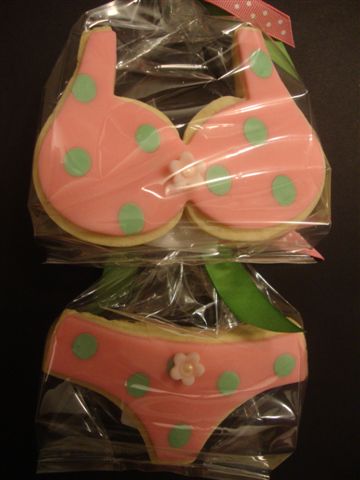
There is know way I can finish up this blog without talking about the favors for Jana's shower.....Beverly hired Janeen Donati of Paige-Reese Designer Bakeshop. It's no secret that I have been a fan of Janeen's since the moment I saw her work. She is truly talented and cares more about her product than her bottom line. Look how fabulous these cookies are...........LOVE HER!


Sunday, February 13, 2011

Wedding Season 2011

The 2011 Wedding Season is officially in full swing and with Valentines Day being tomorrow I thought what better time to introduce some new Wedding Invitations and Save-The-Date options for 2011. I wanted to know what the most popular day to get engaged was, so I did some research. Funny thing is there is not much available with regards to "real statistics" but from year to year about 10% of Americans get engaged on Valentines Day followed by Christmas then Birthday.
The best decision I ever made was becoming an authorized Envelopments Dealer, they offer premium paper and card stocks in 231 colors with 90 shapes and sizes to choose from. Whether you need matte, metallic, textured metallic, vellum and Pattern they have it all. The other thing they offer are incredible samples meant to inspire not only you but your client. Just like there is a lid for every pot I believe there is a designer for every bride and no two are ever alike. I refer to Envelolpments samples as inspiration because that is what they are....they do not provide them so you can copy them they provide them to inspire you, to make you think how can I apply my creativity and take this to another level.

These days I have a LOVE/HATE relationship with my mailbox; one because this years New England winter has destroyed it and at this very moment the only thing holding it up is a large snow bank and two......bills, bills and more bills. Today is Sunday so I finally had to face my mailbox but amongst the bills was a little glimmer of HOPE ..................my new inspiration samples from Envelopments had arrived....................YEAH! I was so excited to open my package and once I saw what was inside I immediately took photos so I could blog about it.


Over the winter I introduced you to the "TWIST CARD" and because they were such a big hit Envelopments has decided to make them available in all colors, patterns and card stocks; I cant wait to use them they are going to be perfect for Save-The-Dates. The next NEW item is actually a COLOR called Soleil available in a bright yellow matte card stock! The pictures I included in this blog are just some of my favorites and every time I look at them I am so inspired to create using these incredible components.......the only thing missing is the vision of a bride.......the lid to this designers pot.


Friday, February 4, 2011

Jana & Richard's Wedding

When it comes to Weddings no matter the culture or religion there is always some sort of symbolism present. I first met Jana one evening while at her neighbors house who I was doing some design work for. Jana told me she was getting married in March at Willowdale. I asked her what she was envisioning for her wedding invitations, her response was she wanted to incorporate a horseshoe. For most people the horseshoe is a symbol of luck but for Jana and Richard it was not only a symbol of luck but a symbol of love. Jana owns three horses and Richard is a Veterinarian to them......which is how the two met....how fabulous is that!


Jana and Richard loved the idea of having their own logo which would be used on all the components of the invitation. I first created them a horseshoe then used the pattern from their chosen wedding card stock inside of it. The main invitation was a 5x5 square pocket fold, the exterior was a white raw silk that displayed their custom logo on a two layered button. The interior of the invitation shows the stunning black paisley pattern that is used in the horseshoe. The invite was mounted on a beautiful pink card stock called boa, Jana did not want the pink to be over powering so I only used it in certain parts like on the response card the word "accepts" is written in pink. The left pocket of the invitation held the directions card and the response card. The logo was also used on the return address envelopes, thank you notes, and favor tags.


When designing invitations that are a unique size, have multiple layers or pockets I can pretty much guarantee you that the postage will not be your typical wedding stamp. Thankfully you no longer have to put multiple stamps across your envelopes, there are many options now available for custom postage. Jana had all her envelopes custom printed using the same font from the invitation, she also decided that having her logo on the stamp would be a nice touch and create a finished look. A week ago I got an email from Jana reading "Houston.....we have lift off" the invites were in the mail. I actually spoke with Jana today and she was so happy with the amount of people that have called, texted and emailed letting her know how much they loved the invitations. As a designer that's exactly what you want your clients to hear!


Lots of things I design or create are done because someone or something inspired me but with the two designs below it was actually a mistake that gave me the inspiration. When I ordered Jana's card stock they first came in with the pocket at the bottom instead of on the side. I was looking at them thinking what could I use them for..........I first designed a menu card to be inserted in the pocket but instead of putting it in the napkin which is typical I decided to add ribbon so that it could hang from the chairs of each wedding guest. The next design plays two roles, the front is a table number then on the other side there is a pocket which can hold a menu. This is a nice option should you not want to do a menu for each individual guest.


Friday, January 28, 2011

Welcome baby George

Susan has used me for so many of her life's moments that I have lost count at this point. Every year I do her family Christmas Card but this year I knew was going to be different because she was expecting her fourth child late in December.  She wanted to wait and do a Holiday/New Year/Birth Announcement all in one type of design. Any parent will tell you that trying to get all your children to sit for a photo can bring out the "scary mom" in all of us and the more you have the more challenging it is.


The design idea was initially going to have one photo of the three girls and their new baby brother, but in the end we ended up with two photos. I had an incredible photo of George wrapped in a moss green blanket tied with a cream satin ribbon sitting in a copper bowl and an equally stunning photo of the girls outside with the snow falling in the background. When it came time to choose the colors I decided neutrals would be best because of the color schemes in each photo. The main card is in a Ecru Silk Linen with a photo backing card in Crepe. I felt it would be best to use an Envelope in a similar color found in the blanket since that was the first photo you saw.


Even though we had two photos with two very different color schemes I feel as if we achieved two designs within one. Even though the girls are in pink and blue when I mounted the photo against the cream card stock it picks up the snow falling in the background which just looks beautiful.

Monday, January 10, 2011

My First Wedding........

If you read my blog often then you know I never design just to create a sample.....which explains why this very special wedding is actually my first. It's not that I can't design for any type of event it's that I choose to design with a purpose and that purpose for me begins with a person. To get the full story about Ashley and Jay I suggest going back to my blog in March where I talked about their very special save-the-dates and the Reason To Give Wedding that was given to them.


Wedding invitations are a very important part of the wedding, it's the first item people will see that reflects what to expect. I kept with the same color scheme for the invitations that I used for the save-the-dates except instead of using the glitter I decided to use more pattern card stock and create them a logo that would be used on coordinating pieces. Ashley LOVED the idea of a square invitation with a pocket and button.  I love the element of surprise and that's exactly what this invitation gave to every guest who received one. The envelope was a shimmery beige color called Pyrite with a Black Linen envelope liner.


Everyone's envelope was printed in the same font used in the invitation and then on the back was Ashley and Jay's logo that I designed for them. This is the first time you see just a hint of red pattern. The outside of the invitation continued with the Pyrite color and a custom two layer button that had their logo printed on it..........the SURPRISE is when you open the invitation! I had the paper company reverse the pattern so that it would be on the inside......which gave a real element of surprise. I continued the use of their logo on the response card, the response envelope  and slightly adjusted it for the cocktails & reception card.


Next up was a little bit of sparkle........all the table numbers were printed on Pyrite with red glitter then was mounted on a folded Black Linen card. For Ashley and Jay's table I used the same card stock but instead of a number I decide to use their logo since they were having their own personal table. Not to get off the topic of the invitations but there is no way I can talk about these two photos without mentioning Gregory Costa-Saint John of Flou(-e)r  he is truly a talented individual and totally went above and beyond to make the flowers at Ashley and Jay's Wedding first rate as did all the vendors that donated.


The guest book is always nice to have but I wanted them to have something that was unique so I designed them there own using all the coordinating card stocks from the invitation. The pages were blank sheets of the Pyrite color paper so each guest could not only sign their name but leave a special message to them.


Next up is the favor boxes which was a collaboration between me and JJ's Haute Chocolat.  Owners Jen and Julie donated a stunning candy bar which is what guests received as a favor. I didn't want guests to have a typical place card so I decided to take the favor boxes and attach a custom handle each printed with the guests names and seating location. When guests first entered the room they were greeted by a round table with a sign that read "Find your name and take your seat. Save this box for a sweet treat"


I'm so grateful to be a part of Reason To Give, this was our first venture and my first Wedding Invitation Design, I could not have had a better couple.  The night we left Ashley's parents house we all said they were the type of couple that made you want to do more and every single vendor that donated said the same thing after meeting them. If you've read any of the interviews Ashley and Jay always talk about how we changed their lives but in the end it was them who changed mine. To Heidi, Lisa and Natasha this was personally such a great experience for me and by far exceeded my expectations........none of this would have happened if not for the three of you believing that an idea could really be a reality when put in the hands of the right women.