In my previous blog I said "if there is something you want ASK, if I can create it I will." I received an email late Tuesday night from my friend and really good customer Krista with a special request. She had been reading my recent blog and saw the picture of the "Mommy Juice" wine tag which gave her an idea. On Saturday she is going to a Bridal Shower and bought the couple their wine glasses and was going to put a few bottles of wine with it in a basket. Krista asked if I had ever heard of "Wine Poems-the 6 Firsts" which I had not so I clicked on the link which took me to this fabulous blog called The Perfect Bridesmaid. She wanted to know if I could put the poems on individual wine tags that she could put with the bottles of wine......OMG what a brilliant idea. This is why I LOVE being custom, it is nice to know that when a client has a vision that I can help make it a reality for them.....even with only 3 days notice!
So off I went to create the wine tags, I started with the timeless color scheme of light blue and chocolate brown and paired it with one of my favorite fonts MonteCarlo. The poems looked nice on the tags but I felt it needed something more personal....so I designed the couple their own monogram added a bit of glitter to it and positioned it below the poem.......PERFECT!
I would like to give a big thank you to Krista for sending me all the photos and for inspiring yet another great design. She has been on a roll lately because last week she needed a plate with a train on it. The funny thing is I didn't have one but thanks to her request I now have a super cute train and a little guy named Jack will soon be the first one to have this plate.
NOTE: for direct link to Wine Poems-the 6 Firsts
click the link below.
theperfectbridesmaid.blogspot.com/2010/03/wine-poem-6-firsts.html?utm_source=feedburner&utm_medium=feed utm_campaign=Feed%3A+ThePerfectBridesmaid+%28The+Perfect+Bridesmaid%29.
Saturday, August 7, 2010
Sunday, August 1, 2010
BeeCustom Designs First Home Party!!!!
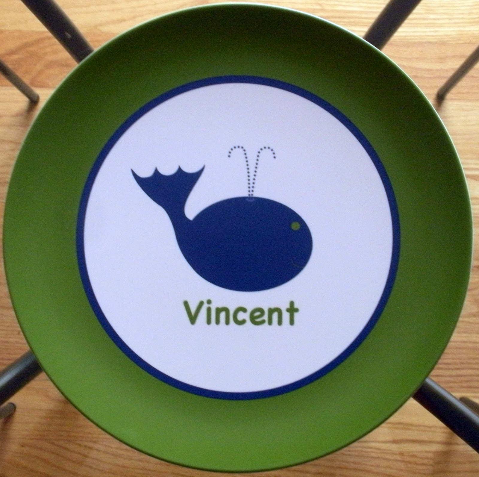
About two months ago I received an email from Janeen, she had purchased some note cards at Mason & Madison and was interested in ordering some more personalized stationery. I operate on a very custom basis therefore, if you don't see what you need just ask, if I can create it I will. Janeen had two requests, first was she wanted a flat card with an envelope that had one of my cupcakes on it and for it to read Happy Birthday Love, Madison and Emerson that way every time she was heading to a party she already had a card to put with the gift....LOVE THIS! The second request was, would I do a home party? I was so excited because this would be my first one. I always wanted to do home shows but never pushed it because not everyone is a stationery person and I would never want someone to feel like they had to buy something just because they were invited. I created cute glittered invitations for Janeen to mail out to all her friends which got a great response. This being my first show I didn't know what to expect.......a lot of people purchased items from the cash and carry line and some ordered stationery to be personalized while others wanted Janeen's inspired birthday cards for their kids but by far the biggest seller of the night were the plates and bowls. These are a great gifts to give, because you can pick your artwork, color scheme and then have it personalized below are some of my favorites!
To Janeen, her family and friends, thank you so much for coming out and making my first home show a truly memorable one. I had such a good time and hope that all of you were please with what you ordered. So now you know BeeCustom Designs does home shows by request, if are interested in having one please feel free to shoot me an email beecustom@verizon.net.
Labels:
BeeCustom Design Happenings
Wednesday, July 28, 2010
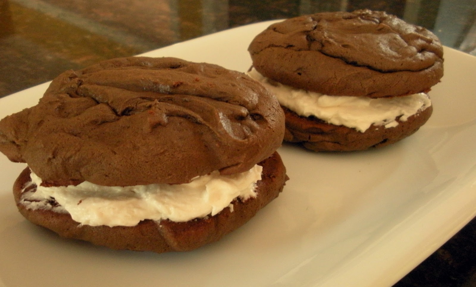
Whale of a WHOOPIE!
As you know I'm a graphic designer who mainly designs custom invitations....but I also own a restaurant in Wakefield with my husband Peter called ZALEKS named after our boys Zac and Alec. We've been open now for 5 years and over the last couple of weeks we have been working on a mini makeover. I just finished redesigning all of our menu boards and soon will be re-painting the interior too! Peter gets a lot of requests from our customers wanting something sweet.....so he asked me if I could make some WHOOPIE PIES to test out. My first thought was NO.......I have way to much on my plate but then my second thought was OK, BUT only if you come up with a cool name that way I can design a logo, signage, and packaging.
After throwing around a lot of different names he called me one afternoon and said what about "Whale of a WHOOPIE" I thought it was perfect because whoopie pies are a very New England item and so is the whale......an extra bonus for me was I already had a whale created. Zaleks has a huge menu of everything but our niche is seafood so I felt the logo and color scheme really worked well with the overall feel of the restaurant.
I made my first batch of 14 chocolate whoopie pies and brought them in on a Monday at 4pm. They were displayed on the counter with an adorable sign and each of the whoopie pies were packaged with a round glittered logo. By 9pm Peter called to tell me that we had already sold 10 and that everyone not only liked the whoopie pies but LOVED the packaging...YEAH! As long as they continue to sell I plan on adding pumpkin whoopie pies with cream cheese frosting and red velvet too.
I have to say I wasn't nervous about packaging the product....for me being creative is my comfort zone but when it comes to cooking.......let's just say if you happened to be at my Bridal Shower then you know there wasn't a shortage of jokes every time I opened a kitchen product. I CAN cook and bake but I am know where near as talented as my husband who is an amazing, self taught cook. For 16 years I have watch him cook for family, friends and customers never once looking at a recipe. I have seen his creative ability to come up with countless unique dishes for Zaleks daily specials each one out doing the next.
So if you happen to be in Wakefield stop by for lunch or dinner, bring your friends, a few bottles of wine (yes we are BYOB) sit inside or out and please don't leave without a Whale of a WHOOPIE PIE!!!!!!!!
After throwing around a lot of different names he called me one afternoon and said what about "Whale of a WHOOPIE" I thought it was perfect because whoopie pies are a very New England item and so is the whale......an extra bonus for me was I already had a whale created. Zaleks has a huge menu of everything but our niche is seafood so I felt the logo and color scheme really worked well with the overall feel of the restaurant.
I made my first batch of 14 chocolate whoopie pies and brought them in on a Monday at 4pm. They were displayed on the counter with an adorable sign and each of the whoopie pies were packaged with a round glittered logo. By 9pm Peter called to tell me that we had already sold 10 and that everyone not only liked the whoopie pies but LOVED the packaging...YEAH! As long as they continue to sell I plan on adding pumpkin whoopie pies with cream cheese frosting and red velvet too.
I have to say I wasn't nervous about packaging the product....for me being creative is my comfort zone but when it comes to cooking.......let's just say if you happened to be at my Bridal Shower then you know there wasn't a shortage of jokes every time I opened a kitchen product. I CAN cook and bake but I am know where near as talented as my husband who is an amazing, self taught cook. For 16 years I have watch him cook for family, friends and customers never once looking at a recipe. I have seen his creative ability to come up with countless unique dishes for Zaleks daily specials each one out doing the next.
So if you happen to be in Wakefield stop by for lunch or dinner, bring your friends, a few bottles of wine (yes we are BYOB) sit inside or out and please don't leave without a Whale of a WHOOPIE PIE!!!!!!!!
Labels:
Graphic Design
Saturday, July 10, 2010
The GORMAN CARNIVAL......is coming to town!
It's becoming very popular now for families to have ONE birthday party for all of their children rather than one for each. All the Gorman kids were born in the month of August so having a joint party was perfect. The idea for a carnival theme was brilliant based on the age range of children that would be coming. I was given full control of what the design would be as long as the color scheme was red and blue and it contained absolutely NO CLOWNS......Liam is afraid.....can't say I blame him either.
The main backing card was a red matte card stock called Geisha, the invite was printed on White Linen and the envelope was a stunning blue matte card stock called Aruba. Now that I had the card stocks picked out it was time to decide on the other elements. I knew I wanted to have some sparkle to the invite and felt the flags represented the carnival theme well and would look fabulous glittered. Next up was finding two fonts a carnival style and a more simpler one to compliment it. By having the text of the invite all parallel and mixing the two fonts it creates an element of design that works but is not over powering. I continued the use of the two fonts for the return address on the envelope as well as the optional custom address printing for the front of the envelope.
I had so much fun designing this invitation not only because I have always wanted to do a carnival theme but also because the clients were the GORMANS. This fabulous family consists of dad Joe, mom Krista, big brother Liam, twins Ryan & Anna.....oh and last but not least Greta the dog. If you read my blog then you know I consider it an honor to be a part of people's life moments, this has never been more true. Before Krista was the wife to one and mom to three she was my friend. I've known her now for twenty years and have been a part of many of her life moments not as a designer but always as a friend. It was an honor that she asked me to play both roles this time around:) So to you Krista, it's been a long road with many good memories and plenty of scary photos!
Labels:
Children's Birthday Parties
Friday, June 25, 2010
Fabulous In Full Force North of Boston
For two years I have followed all the events that Julie Fairweather owner of In Full Force was behind www.infullforce.com, waiting for the right one to participate in. I was so excited when I learned that In Full Force would be doing another Fabulous North of Boston event. It was held under a tent located at the Harbor Marina in Newburyport. This event was meant to showcase everything that is cosmopolitan on the North Shore and I knew it would be the perfect place to showcase my work. When I first arrived I found my table and began to set up, within a few minutes I was approach by two different individuals offering to help me unload my car and seeing if I needed anything......so nice! An added bonus for me was finding out my friend Natasha of Natasha Bansfield Events www.natashabansfieldevents.com was one of my neighbors...YEAH!
I have done shows before but this was my first really big one, so I really wasn't sure what to expect. June 10th arrived and so did the rain, but that didn't stop the incredible turn out of people. Just as the event kicked off I looked outside and it was down pouring but the harder it poured the more people filled the tent.....which totally amazed me. One of the genius ideas of In Full Force was having the fashion show in the tent with all the displaying vendors this is important because as a participating vendor you are there to showcase your product and network, having it separated would clearly make it impossible for vendors to keep people at their tables.
After doing so many small shows over the last two years I've learned what you need to keep people interested. I had a full display of my cash and carry line as well as a lot of my custom samples. I decided to do a free raffle and because it was June I thought a teacher gift would be smart. The bucket contained a paper weight, melamine plate, bookmark and note cards all from my "teachers give a hoot" line. Liz White of Mason & Madison www.masonandmadison.com put together all my glittered goodies in the perfect bucket. Congrats to Helen Santos of Beverly she was the lucky winner of my raffle.
If you read my blog often you know that a lot of my designs are glittered by hand, with so many vendors in one area I felt the need to stand out therefore handing out my regular business cards would not do. I decided to get candy bars and make a custom wrapper with my hot pink glittered B on the front and my info on the back.....hoping it would leave a lasting impression. Liz was kind enough to brave the rain to come out and help at my table that night, standing in the middle of the tent passing out my candy bars and directing people to my display.
Labels:
BeeCustom Design Happenings
Saturday, June 19, 2010
Happy Birthday Mason & Madison
successful years to come:)
Labels:
BeeCustom Design Happenings
Saturday, June 12, 2010
When life hands you WHITE LINEN........
It's hard to believe that it has been a whole year since I starting working with Liz White of Mason & Madison. She wanted to throw a first birthday celebration for her store and the original plan was "cupcakes and cocktails" with a black linen pocket fold that would hold the invite, VIP card and then be inserted into a bubble gum pink shimmery envelope. However, like many clients Liz had a change of heart with regards to her idea and really wanted to change it to a Candy Land themed party. I LOVED the new idea but there was not enough time to order new card stock. So two white linen flat cards and one shimmery pink envelope is all I had to work with. As a designer it's situations like these that really challenge you to tap your creative skills.

I decided the color scheme for the inks would be bubble gum pink and apple green. For the invitation I created two pieces of candy that were hand embellished with clear glitter allowing the bubble gum pink to shine through. The most challenging piece for me was the VIP card because it was the same white linen card stock as the invitation but just a bit smaller. VIP as we all know means "very important person" this piece needed to be unique but still coordinate with the main invitation.
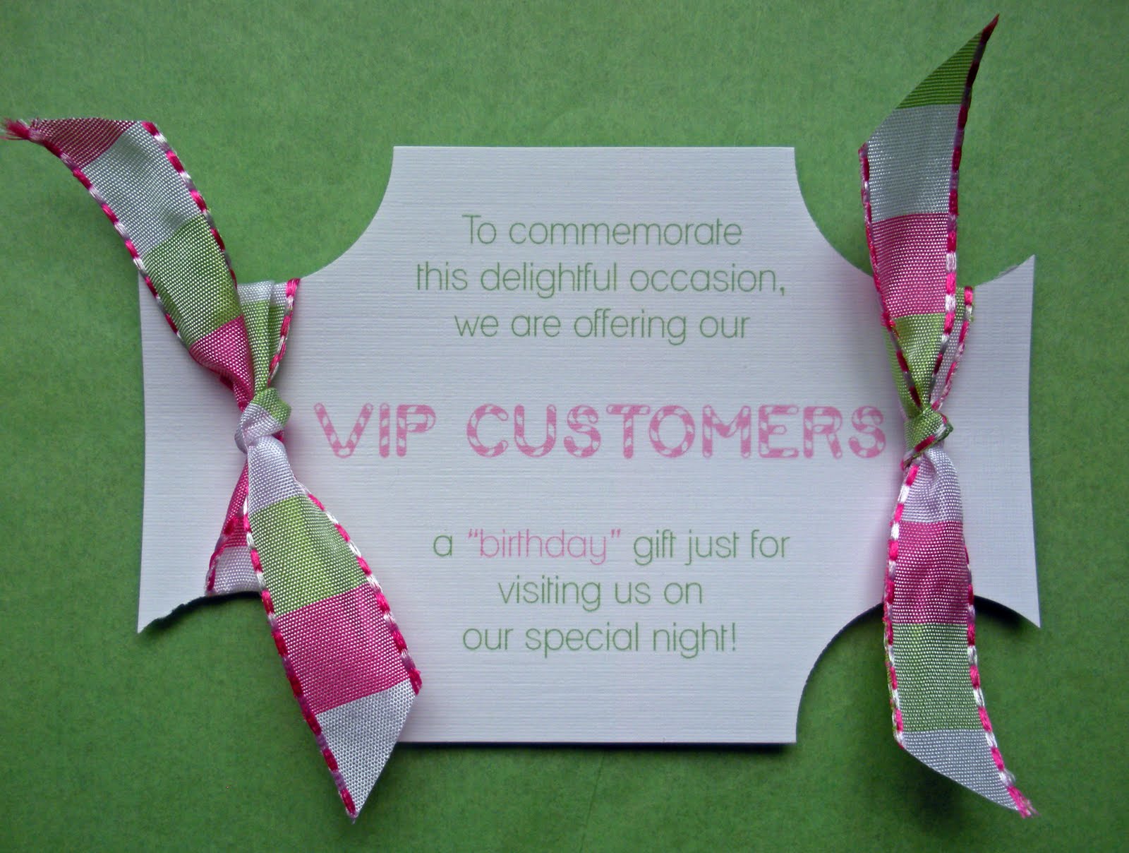
My first thought was to make it a circle cut out with a stick giving the look and feel of a lollipop but as I sat on the floor of my office I noticed one of my check ribbons. This green and pink ribbon is the first ribbon I ever bought when I started designing. I LOVED it so much that I bought 3 rolls which was a good thing because as I looked at the white linen card stock, the ribbon and my circle punch the perfect solution came to me. As you can see the VIP card actually resembles the glittered candy from the invite. I needed the "VIP CUSTOMERS" line to stand out so I chose a similar candy style font that resembles the one used in the Candy Land Game. The cards were printed first, then the four corners were punched out and finally finished with a bit of trimming.........TADAH!

Last stop was the envelope......thankfully it was not white linen but I felt it needed something special to tie everything together. Printed envelopes always give a more completed look therefore all 50 VIP guests received a custom printed envelope that had their name in the Candy Land font. I was so pleased with the end result and most importantly so was Liz. So my advice is "when life gives you white linen.......embrace the challenge because it will help you become a better designer.
I decided the color scheme for the inks would be bubble gum pink and apple green. For the invitation I created two pieces of candy that were hand embellished with clear glitter allowing the bubble gum pink to shine through. The most challenging piece for me was the VIP card because it was the same white linen card stock as the invitation but just a bit smaller. VIP as we all know means "very important person" this piece needed to be unique but still coordinate with the main invitation.
My first thought was to make it a circle cut out with a stick giving the look and feel of a lollipop but as I sat on the floor of my office I noticed one of my check ribbons. This green and pink ribbon is the first ribbon I ever bought when I started designing. I LOVED it so much that I bought 3 rolls which was a good thing because as I looked at the white linen card stock, the ribbon and my circle punch the perfect solution came to me. As you can see the VIP card actually resembles the glittered candy from the invite. I needed the "VIP CUSTOMERS" line to stand out so I chose a similar candy style font that resembles the one used in the Candy Land Game. The cards were printed first, then the four corners were punched out and finally finished with a bit of trimming.........TADAH!
Last stop was the envelope......thankfully it was not white linen but I felt it needed something special to tie everything together. Printed envelopes always give a more completed look therefore all 50 VIP guests received a custom printed envelope that had their name in the Candy Land font. I was so pleased with the end result and most importantly so was Liz. So my advice is "when life gives you white linen.......embrace the challenge because it will help you become a better designer.
Labels:
Invitations
Saturday, June 5, 2010
Oh "BOY" this girl could use a party!!!!!!!!
I met Natasha a little over a year ago and it was a match from the very first meeting not only on a business level but as a friend. Natasha is an event planner so of course she is planning her own baby shower. When she first talked to me about invites she was thinking nursery rhymes but then decided to switch gears and make it more about being pregnant, which was smart because after the baby is born you pretty much take a backseat to everything. I was so excited when I first learned that she was pregnant but even more excited because she would be finding out what she was having......BOY'S RULE!!!!!!!!!The release of envelopments new card stocks and favor boxes could not have come at a better time, from the moment I received my samples I knew exactly what I would use for Natasha's baby shower invites. When we met she decided that the belly dress would be perfect. I am always careful when mixing pattern card stocks with glittered artwork because it sometimes can come across as too much.
I fell in love with First Snow Swiss Dots the minute I saw it and new that it was a simple enough pattern to accent the glittered belly perfectly. I used Coal as the main backing card, Caspian as the invite backer and then printed the invitation itself on First Snow. In order for the belly and the dots to work they needed to have slight separation which is achieved by using the pattern not on the invitation but on the envelope liners and then again on the favor boxes. You can see from the photo that all components are perfectly balanced. For the matching thank you notes I didn't want to use the word "thank you" so instead I borrowed a phrase from a really funny T.V. show that since has been canceled.......notes from the underbelly!

The bon bon favor box is the most adorable box I have ever seen.......everyone I show it too loves it. I wanted the box to have a sash and a custom glittered button. The "b" actually symbolizes three things, the first is Natasha's last name which is Bansfield, second is baby, and third is boy. Even though Natasha went with the box for her favors another option would have been the custom candy wrapper which is also super cute.
Invitations are an important element to any event.....it's a sneak peak at what your guests can expect. It's not often that I get to witness the entire event come together but I feel very lucky that I am on the guest list for this one. I will have a part 2 to my blog displaying pictures of all the other beautiful elements of Natasha's baby shower, especially the custom belly cake that is being made......stay tuned!
Labels:
Baby Shower,
Holiday
Subscribe to:
Posts (Atom)