Saturday, June 12, 2010

When life hands you WHITE LINEN........

It's hard to believe that it has been a whole year since I starting working with Liz White of Mason & Madison. She wanted to throw a first birthday celebration for her store and the original plan was "cupcakes and cocktails" with a black linen pocket fold that would hold the invite, VIP card and then be inserted into a bubble gum pink shimmery envelope. However, like many clients Liz had a change of heart with regards to her idea and really wanted to change it to a Candy Land themed party. I LOVED the new idea but there was not enough time to order new card stock. So two white linen flat cards and one shimmery pink envelope is all I had to work with. As a designer it's situations like these that really challenge you to tap your creative skills.


I decided the color scheme for the inks would be bubble gum pink and apple green. For the invitation I created two pieces of candy that were hand embellished with clear glitter allowing the bubble gum pink to shine through. The most challenging piece for me was the VIP card because it was the same white linen card stock as the invitation but just a bit smaller. VIP as we all know means "very important person" this piece needed to be unique but still coordinate with the main invitation.
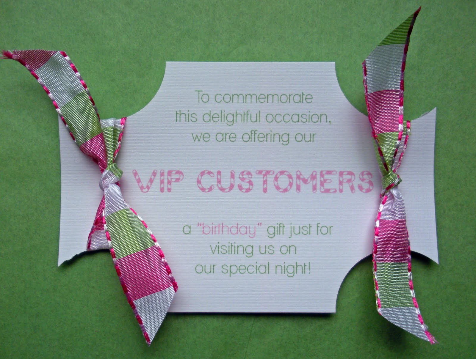
My first thought was to make it a circle cut out with a stick giving the look and feel of a lollipop but as I sat on the floor of my office I noticed one of my check ribbons. This green and pink ribbon is the first ribbon I ever bought when I started designing. I LOVED it so much that I bought 3 rolls which was a good thing because as I looked at the white linen card stock, the ribbon and my circle punch the perfect solution came to me. As you can see the VIP card actually resembles the glittered candy from the invite. I needed the "VIP CUSTOMERS" line to stand out so I chose a similar candy style font that resembles the one used in the Candy Land Game. The cards were printed first, then the four corners were punched out and finally finished with a bit of trimming.........TADAH!


Last stop was the envelope......thankfully it was not white linen but I felt it needed something special to tie everything together. Printed envelopes always give a more completed look therefore all 50 VIP guests received a custom printed envelope that had their name in the Candy Land font. I was so pleased with the end result and most importantly so was Liz. So my advice is "when life gives you white linen.......embrace the challenge because it will help you become a better designer.

Saturday, June 5, 2010

Oh "BOY" this girl could use a party!!!!!!!!

I met Natasha a little over a year ago and it was a match from the very first meeting not only on a business level but as a friend. Natasha is an event planner so of course she is planning her own baby shower. When she first talked to me about invites she was thinking nursery rhymes but then decided to switch gears and make it more about being pregnant, which was smart because after the baby is born you pretty much take a backseat to everything. I was so excited when I first learned that she was pregnant but even more excited because she would be finding out what she was having......BOY'S RULE!!!!!!!!!

The release of envelopments new card stocks and favor boxes could not have come at a better time, from the moment I received my samples I knew exactly what I would use for Natasha's baby shower invites. When we met she decided that the belly dress would be perfect. I am always careful when mixing pattern card stocks with glittered artwork because it sometimes can come across as too much.


I fell in love with First Snow Swiss Dots the minute I saw it and new that it was a simple enough pattern to accent the glittered belly perfectly. I used Coal as the main backing card, Caspian as the invite backer and then printed the invitation itself on First Snow. In order for the belly and the dots to work they needed to have slight separation which is achieved by using the pattern not on the invitation but on the envelope liners and then again on the favor boxes. You can see from the photo that all components are perfectly balanced. For the matching thank you notes I didn't want to use the word "thank you" so instead I borrowed a phrase from a really funny T.V. show that since has been canceled.......notes from the underbelly!


The bon bon favor box is the most adorable box I have ever seen.......everyone I show it too loves it. I wanted the box to have a sash and a custom glittered button. The "b" actually symbolizes three things, the first is Natasha's last name which is Bansfield, second is baby, and third is boy. Even though Natasha went with the box for her favors another option would have been the custom candy wrapper which is also super cute.


Invitations are an important element to any event.....it's a sneak peak at what your guests can expect. It's not often that I get to witness the entire event come together but I feel very lucky that I am on the guest list for this one. I will have a part 2 to my blog displaying pictures of all the other beautiful elements of Natasha's baby shower, especially the custom belly cake that is being made......stay tuned!

Thursday, May 27, 2010

An Elegant Birthday Brunch


I believe that a persons best work most often begins with a challenge and this was exactly the case with a recent invitation order. I am always excited when I get a new client but it means a lot when the reason they are calling is because they had been the recipient of a previous invitation that I had designed. Dawn called me on May 4th about needing invitations for a surprise birthday party she was throwing for her mother but was concerned that she may not have left enough time for custom design invitations. So here lies the challenge.....the party is May 23rd which was exactly 19 days away. I will admit my first thought was "HOLY BANANAS" my second thought was of course you can have custom........I LOVE a challenge!

Normally I meet with a client first to get a feel for their personal style and vision, however time was not on our side. My plan was to do as much research as I could before our meeting which was the very next morning. When we got off the phone the only things I knew about the party was it would be a elegant brunch, outside in Beverly at Misslewood by the water and that there would be a live brass horn band. I knew the band was a huge part of her vision because Dawn had shared with me her family memories of the summers spent in Newport listening to the big bands that would play.


I started by going to Misslewood's website to view photos of the location......the only way to describe the location is "perfection." The entire look and feel would have you thinking you were in Newport. Next up would be the card stock, I went with the paisley pattern of Mehndi. You can see the mix of the caspian blue and rich shimmery antique gold coordinates effortlessly with the vision. I wanted to implement a piece of artwork so I created a saxophone with music notes coming out of it and of course the music notes were hand embellished with clear glitter adding just a hint of sparkle.


Wednesday morning I met with Dawn at BodiScience which is a Holistic Day Spa that she owns in Beverly. I presented my personal interpretation of what I felt her vision was and showed her the card stocks that I picked out, her response was "perfect!" Exactly 6 days later her invites and thank you notes were done and in the mail. This was the fastest custom order I have ever done and by far one of my favorites.

Wednesday, May 19, 2010

My first Bat Mitzvah

Creating a custom invitation is kind of like picking out your wedding dress; what think you want and envision is never what you end up with. This is exactly what happen with a recent client. Debbie came all the way from Newton to meet with me about her daughter Haley's Bat Mitzvah. She was looking through my samples and loved what I had done for an Alison in Wonderland party and really wanted to use the fun font from it. Her vision was for Haley to have her own logo using the colors of yellow and blue. After finishing up a few different samples I forwarded them to Debbie who had the same gut feeling as I did......it was to casual for such a serious event however she was concerned if we went the in the other direction it would be to formal. I told her to give me some time and I would come back with round two. The creative approach I took the second time around was simple "what would I do if it was my daughter" Debbie as well as Haley were very happy with the end result.


Now that we had the logo, it was time to design the invitation. At that point Haley had already received 8 other invitations from numerous friends also planning their Bar/Bat Mitzvahs. This can be a challenge for both the kids and the parents as you try to create your special day while keeping it unique. I was thankful that Debbie chose to work with me because I could guarantee her that nobody would have Haley's invitation or logo because it was solely created for her.


They liked the look of a long invitation, the backing card was a beautiful textured card stock in amethyst, the text card was printed with two ink colors on white linen. Each guest received a custom address label that was attached to the front of a Belize envelope. Haley's logo was also used on the return address labels, thank you notes, and response card. The logo was also given to the entertainment company to use for the favors that would be created on site for all the guests. Debbie was even able to use the logo for custom M & M's that would be on all the tables.

This was my very first Bat Mitzvah and I could not have been blessed with better clients than Debbie and Haley. I loved how the design turned out and learned a lot about what goes into participating in such an event. Haley's big day is just a few weeks away, I am thankful that I was able to play a part in such an important occasion.


Saturday, May 8, 2010

For the LOVE of a font!

I love creating original pieces of artwork that compliment the perfect invitation but you don't always need artwork. By using the perfect font in a design you can achieve unbelievable results. I personally have a total font fetish and can spend countless hours in search of the perfect font.

Communion season is in full swing and I have designed many invitations with numerous variations of the crosses that I have created. One of my very good clients and friend needed some invitations for her son's upcoming communion. Her first question was "do you think I need to have a cross?" Her second question was "Do you think I can use a color other than silver?" My response to both was "of course you can!" My idea was to use a classic color combination of chocolate and blue accented by a clean font called FUTURA.


The main backing card is bronze, the invite was printed on white linen using two ink colors and the envelope was an eye popping blue called zircon. You can see that his name is the main focus of the design and by having the rest of the information flush left and right it has now created a piece of artwork by the use of just one font.

Thursday, April 29, 2010

Barcelona Spain....chapter two!

The Gaudi lizard is a well known icon in Barcelona Spain, Sue wanted it to play a role in the next series of invitations. However, this was my first challenge the mosaic lizard although stunning did not work with what was chosen for card stocks. In order to use him he would need a bit of a makeover.


As you can see by simplifying him to an outline and adding some of the Kitsch pattern to its back he now fits with the look of the invitations. The next step was finding him a spot in this design, my first idea was to make him the logo for the series of upcoming parties, events and meetings that would be taking place. The logo first appears as a custom button on the outside of the invitation, he then made another appearance on the thank you notes.


This invitation is unique because it's designed for not just one party but for 7. It can be a challenge to accommodate that many invitations in one design and still have it look organized. I centered the main invitation then on either side was a custom pocket each having their own band wrap. You will notice with this series of invites I changed the accent of color to yellow topaz which is so striking against the Kitsch pattern.


Thursday, April 22, 2010

Barcelona Spain....chapter one!

This photo was what Sue Campbell brought to me when it was time to design a series of invitations for IDAC'S upcoming events that would take place in Barcelona, Spain. I had recently designed for their other series of events in Naples, Florida and although the parties and meetings were generally the same the look however would be anything but.
My first thought for Barcelona was BOLD.....
and majority of my inspiration came from this photo. For the first series of invites we decided to do a square folded card in coal which has a beautiful shimmer. The photo would be mounted on a shimmery red card stock called jupiter and act as the design element for the front of the invite. The look of this photo on the red then mounted on the coal is really eye catching.


I love having the element of surprise so choosing a pattern card stock like Kitsch was perfect, the whole look of it breaths Barcelona. I first gave each guest a little peak of it on the custom label that was used for the envelope but the big reveal came when you opened the invite. This specific design needed to accommodate the main invitation plus three additional inserts; therefore I was able to use it in two places. The pattern in Kitsch is very modern, the flowers are made up of such beautiful lines and portrays a very clean look. You can see the chosen font has almost the same type of lines as the flower and by making all the text flush right it continues to complement the contemporary look.


Wednesday, March 31, 2010

Professional Photos


I just wanted to share some professional photos that were taken of the save-the-dates that I designed for Ashley and Jay, there is really no subsitution! Thank you to Jim of Creative Sparks Imagery not only is he photographing Ashley and Jay's wedding but he is documenting their entire journey. You can go to www.creativesparksimagery.com to view more of his work.